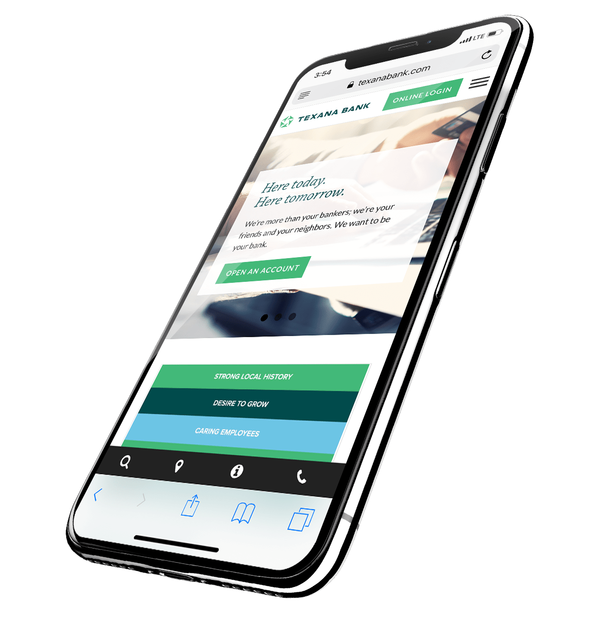
Did you receive a threatening letter accusing your bank of having a website that violated the Americans with Disabilities Act?
Access Now, an accessibility advocacy group sent scary letters to many banks alleging ADA violations. The letters offered to resolve alleged violations through Access Now’s attorneys but threatened legal action for banks who didn’t cooperate.
Late last year, the Independent Community Bankers of America reached an agreement to stop the mailings as long as ICBA adopted and distributed a statement of voluntary accessibility principles.
The principles encourage member banks to make their websites and electronic banking services accessible to visually impaired and low vision customers and prospects. The principles also state that, if the Department of Justice doesn’t issue formal online accessibility guidelines in 2018, ICBA will encourage its members to adopt their principles before 2021.
The Department of Justice has not outlined its own legal standards for accessibility but has pointed to the Web Content Accessibility Guidelines on numerous occasions.
Two things are clear regardless of a strict mandate:
1. Online accessibility regulations are coming sooner or later and it’s best to be prepared.
2. As a bank, you offer such universal and vital services that accessibility should be your goal regardless of regulation.
Here are a few tips to get you started:
1. Scalable Text
What to look for:
Many designers set their website’s text in specific fonts and sizes, and their decisions usually make pages easier to read—especially since the days of flashing text are behind us. While those design decisions are important, rigidly defined text can be a problem for some users.
Why It’s An Issue:
Users with low vision, dyslexia and other cognitive and learning disabilities need to change the size and font of web text in order to be able to read it.
What to Do:
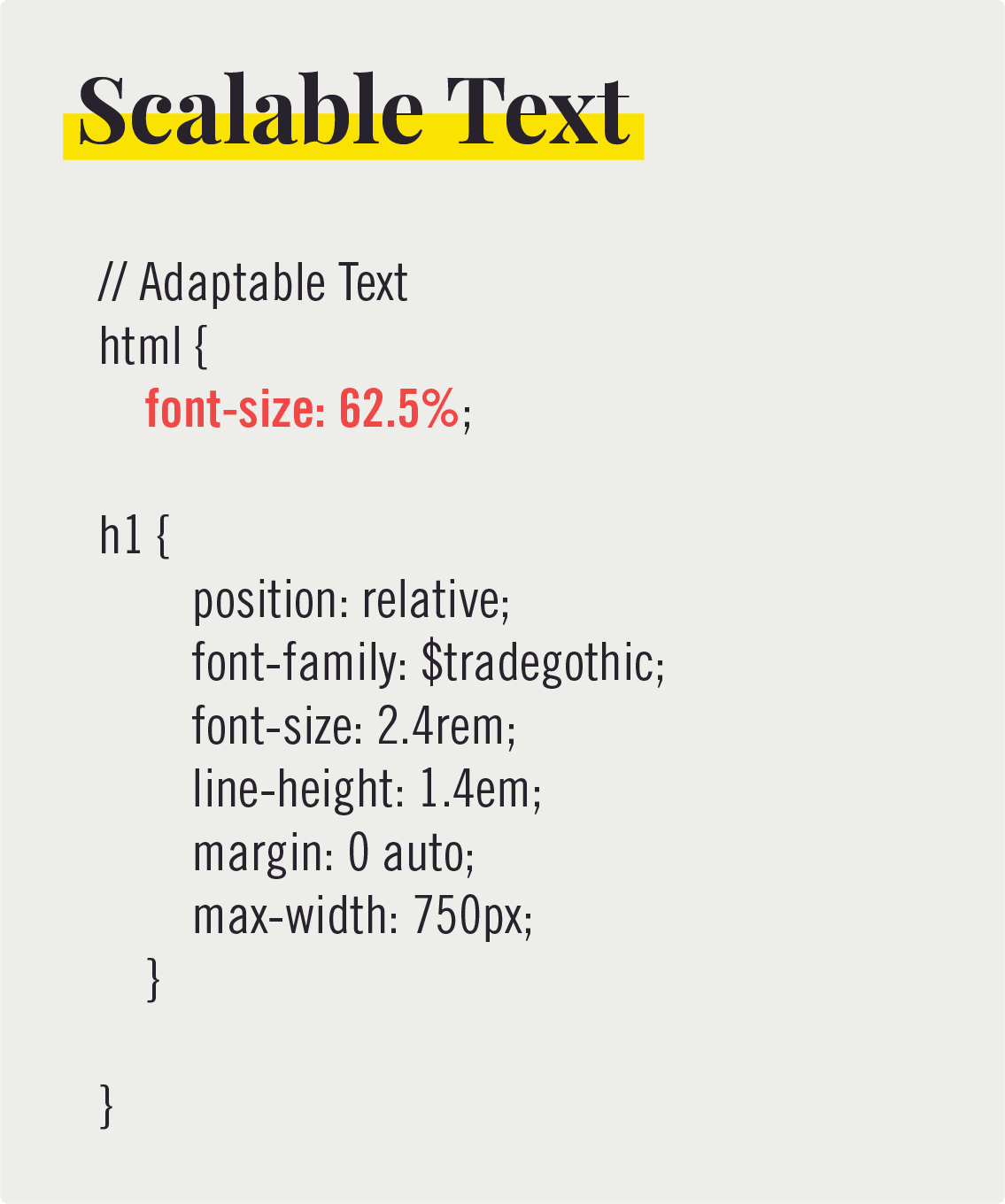
Instead of setting an exact font size using numbers of pixels, use scalable units to determine font size. This makes your site more adaptable and accessible.
2. Images Without a Text Description
What to look for:
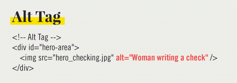
Do your images have clear captions and alternate descriptions?
Why It’s An Issue:
Text to speech or refreshable Braille displays can’t convert images into spoken or tactile words. This means any information conveyed through an image won’t be communicated to these users.
What to Do:
Whenever you add an image to your website, be sure to add an HTML “alt tag” describing the image. For content management systems like WordPress, “Alt Text” should be an option when uploading files to your media library. As an added benefit, additional text descriptions of photos will help generate better SEO results for your website.
3. Keyboard Navigation
What to look for:
Can you navigate through your website fully using your keyboard’s arrow and tab keys or do some of the features require a mouse in order to be triggered?
Why It’s An Issue:
People with a wide range of disabilities and motor function rely on using a keyboard to navigate the computer instead of a mouse.
What to Do:
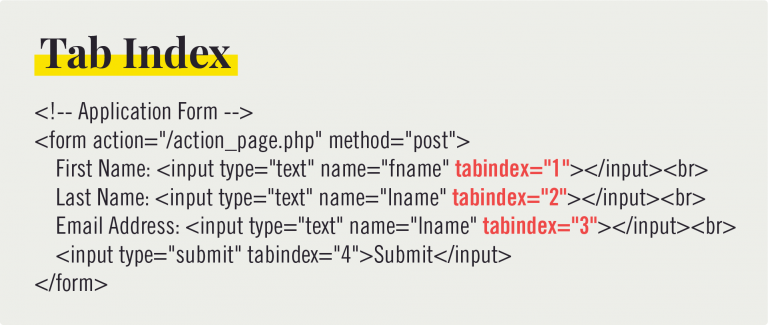
For each of your site’s navigable items, like menus or buttons, insert a “tabindex” into each HTML element. The tabindex simply gives web browsers a numbered list so they know which elements to jump to (tabindex=“1” or tabindex=“5”).
4. Orienting Language
What to look for:
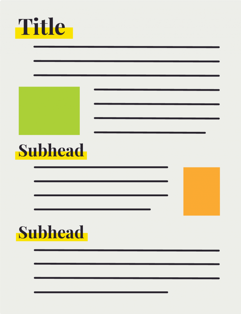
Does your website contain helpful headings before introducing new elements and subheadings to break up large blocks of text?
Why It’s An Issue:
For blind or low-sight users, large blocks of text can be disorienting since they’re navigating your website using text-to-speech tools.
What to Do:
Before introducing a new element or idea, place a headline so users know what to expect and break up blocks of text with subheadings to help orient them to your website’s narrative.
5. Formatted Documents
What to look for:
When you open .pdf files downloaded from your website, can you search and select the text? Does your computer recognize the file as a text file or as an image file?
Why It’s An Issue:
Many times, .pdf files are nothing more than scanned documents, which means the computer reads them as images instead of as text. For people using text-to-speech software to navigate your site, these files are unusable.
What to Do:
When saving files to be uploaded to your website, be sure they are in a text-based file format used by most computer users like .docx or .pdf. If you must use a scanned document, use an Optical Character Recognition (OCR) tool like Adobe Acrobat to convert the image to text.

More of the world is online every day, meaning online access is no longer a privilege. It’s a necessity. It is better to begin working toward accessibility for all today than to implement a complete overhaul as these suggestions become rules. And above all, as a financial institution, it’s vital to make your tools available to all your customers.

