Hey, I’m Riley. You’re reading the first installment of a 10-part series in which I open a checking account at 10 different banks to find out how they make their customers feel, learn what they’re doing well and see what they’re doing poorly.
We’ve kept the banks anonymous to protect the integrity of the project—hopefully, you’ll see your institution in some of them. Hover or click on the bank names to learn more about them as you read. If you missed the last post, start here to learn more about me and this project—10 Banks, 10 Accounts.

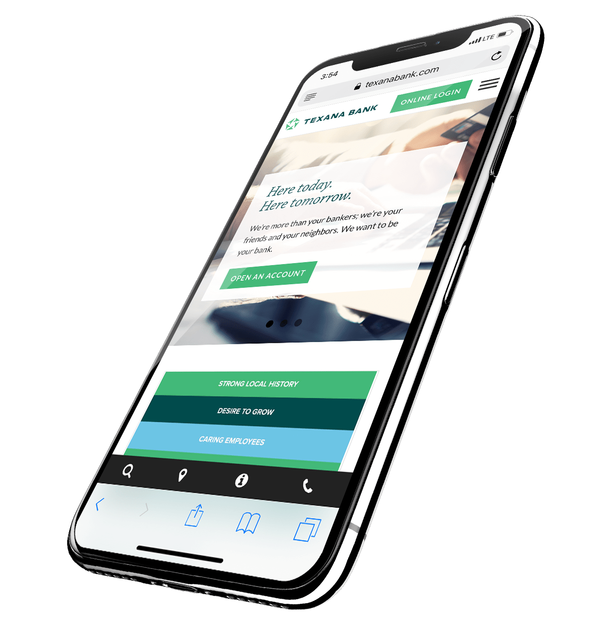
Where do your clients start when they’re investigating your bank? Online. So, I started this journey in the same place.
If I need to convince you of how important your bank’s online presence is, you can stop reading right now. I’m going to assume you know digital banking matched traditional banking as customers’ primary method of banking in 2015, and that digital banking has gained momentum every year since.
Your website is your most important bank branch. It’s likely visited more than any of your physical branches. Your website serves as a snapshot of who you are, and it sets an expectation before you ever meet potential clients in a physical branch. For prospective customers, your site is your brand’s first impression. Whether you like it or not, it gives them a feel for your priorities and what doing business with you will be like.
From my research, it looks like too many banks use only other banks as the measuring stick for success on the web.
On the internet, “somewhere else” isn’t just another bank. Your potential clients are comparing the experience your website provides with other entities with whom you don’t even compete. Is your site as easy to use as Facebook is? Is it as intuitive as Google? Does it provide as much value as Amazon? Every minute someone chooses to spend on your site is a minute they choose not to binge-watch cat videos, fire off direct messages to friends, or read an alert that their favorite movie is now available on Netflix.
It’s not fair, but your site isn’t just being compared to those of your peers, but every other site on the Web, too.
Why is that bad?
Banking sites are pretty much the most boring things on the internet, but I did find a few that provided true value and seemed to be designed and programmed sometime in the recent past. Unfortunately, they were few and far between.
Plug-it-in perpetrators
I’m not into conspiracies, but…BUT…I’m not convinced there’s not a “bad website” generator out there being used by banks. In truth, I did see plenty with the same “Powered by” badge at the bottom, but this is about reviewing your competition—not ours.
In short, the bad behavior characteristics of bank websites was astoundingly similar from one site to the next.
- Dated designs
- Dated functionality
- Confusing navigation
- A lack of content (outside the same stuff that’s printed on in-branch brochures)
Over half the websites I looked at felt this way—from nearly identical layouts to flimsy financial education articles and stock photography of people smiling as if someone just off camera is promising “just one more shot.”
Each of these sites felt stilted and boring, but they weren’t offensive or unnavigable. They felt, and I sigh as I say this, fine. And forgettable. But aesthetics isn’t completely to blame for the lackluster impression each of them made.
They simply had no direction. Nothing on these sites felt intentional, nothing led to anything else. They’re sandboxes of purposeless content placed only to fill space.
What’s worse? They all came off inauthentic and shallow in exactly the same way as the next bank’s website.
But that’s not the worst part. The true failure is that, as mentioned earlier, clients’ experience on the web extends waaaaaaaaay beyond bank websites. Again, you’re not just being compared to banks. You’re being compared to every other website on the Internet.
But you’re not here for the advice. You want the “Epic Fail Video Compilation — Bank Edition” This isn’t YouTube, but there are plenty of fails at which we can laugh and point.
Android Community Bank
After absorbing 10 bank websites, it seems I grossly overestimated banks’ abilities to communicate with their customers.
Top 10 Megabank, a $2 trillion institution, boasts a website that looks and functions like the junk drawer in my mom’s kitchen. I could hardly move around in it at all. It seems that this might be “Template Zero”—the site from which all of the bad bank websites spawned.
Meanwhile, Footprint Protector’s site feels so robotic that it’s almost become a parody of itself. Stock and corporate from top to bottom, its “History” page gives nothing beyond a cold chronicling of the bank’s expansion. Its “Vision” section reveals that Footprint Protector aspires to be nothing more than a “premier financial services company.” This jargon fails miserably, because Footprint Protector fails to use this space to give insight to a “vision” that’s different from those seen at any other bank.
From a general standpoint, there’s not much to tell. All 10 websites fell below the standards set by national retail brands—you know, the brands that clients fall in love with.
Banks, let’s face it. We’re behind in this area. But my job was to compare just banks, and I did have a couple of experiences that were better than the rest.
Be Straightforward. Be Authentic. Add Value.
The bank websites that are straightforward, authentic, and added value stuck out—to the degree that any average customer would notice. And they each found different ways to do so.
Super Regional Bank’s website, for instance, follows the Bad Bank Website Generator template, but it felt uncluttered and current—not dated and stale like many templated plug-and-go sites I saw. Its content was arranged logically on the page (it seems someone at Super Regional Bank has at least heard of the content funnel). Super Regional Bank’s articles had some meat to them, and its financial literacy curriculum was both eye-catching and immersive.
Regional Creeper’s website offers a more modern look, but its clever hover states and mobile optimization aren’t what gives it value. Rather, Regional Creeper simply leans into its own identity. Each piece of content is accompanied by a photo, a byline, and the job title of its author. On Regional Creeper’s “About” page, I read about the bank’s founding amid booming timber and agriculture industries in the region. Regional Creeper’s values are concrete and measurable.
These banks feel fully-realized in terms of identity. They’d made choices about their priorities, and showed self-awareness of their customer base and their bank’s strengths.
Your story and your expertise and your people make your bank unique. Why not put them on display? It adds an element of accountability and makes you look like real people, not folks who sleep every night in business suits.
If you want to read more shine or shade on other banks, keep a look out in two weeks for The Report, a brief bank-by-bank summarization of my experiences.
In Conclusion…
The first impressions weren’t very impressive. Obviously, here’s the question you must ask yourself: “how’s mine?”
I can wish you more than good luck with that. We have several resources on our blog that can help improve your website.
The best advice I can leave you with, though, is this: don’t forget to look outside your industry for inspiration. There are brands out there building a real following. That’s who you should be taking cues from—not just another bank because they’re bigger or perceived to be more successful than yours is.
Beyond functionality, everything boils down to whether you help your customers or not. That’s the true, real-world definition of value. If your website isn’t designed and thought-out with the purpose of helping your current and prospective customers alike, then, frankly, you’re doing it backwards.
Next month, I’ll talk about the experience of opening an account in person at each of our 10 banks.