10 Banks, 10 Accounts is a 10-part series in which we sent one of our copywriters Riley on a mission to open a checking account at 10 different banks to find out how they make their customers feel, learn what they’re doing well and see what they’re doing poorly.
We’ve kept the banks anonymous to protect the integrity of the project—hopefully, you’ll see your institution in some of them. Hover or click on the bank names to learn more about them as you read. If this is your first time reading, start here to learn more about Riley and this project—10 Banks, 10 Accounts.

Hey, Riley here.
Last post I talked about the brands and websites of our 10 banks and discussed some common denominators of banks who were successful and banks who fell flat in these areas. If you missed that one, check it out here.
What you’re reading now, The Full Report, are my observations that may not have made it into that post. Think of them as my field notes.
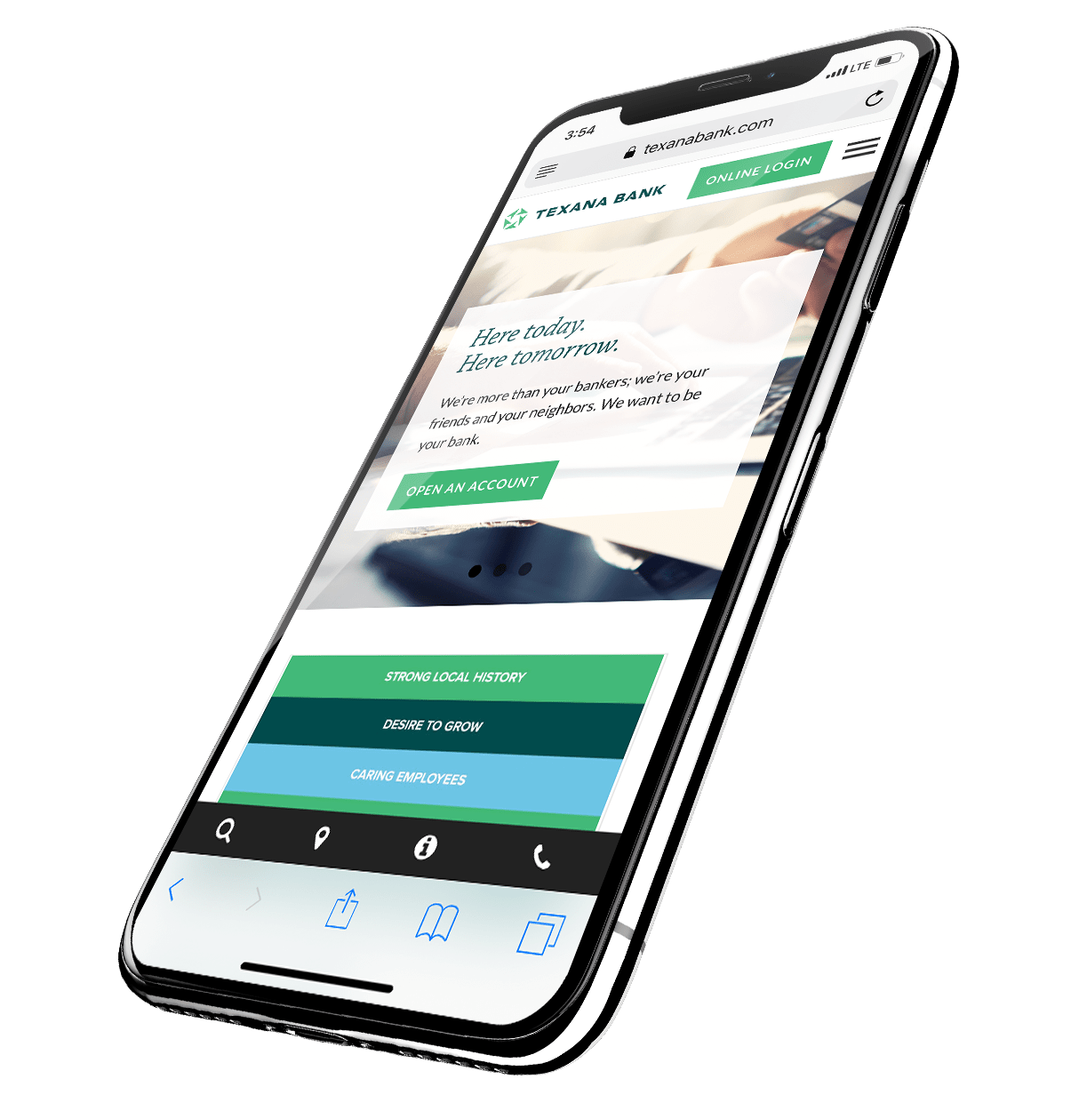
Top 10 Megabank // Billions & Billions (& Billions)
The website is cluttered and information seems to have been arranged without intention or purpose. It isn’t exactly hard to navigate, but it feels two-dimensional and haphazardly traditional. Typography and brand elements are as basic and uninteresting as its message. However, by being so generic, Top 10 Megabank doesn’t go so far as to offend.
Overall impression: I expect a somewhat stiff and transactional experience. The whole thing has a big-ass bank feel, and I want to get in and out as fast as possible.
Super Regional // $200-500B
This site isn’t as smooth-looking as, say, Regional Hotshot’s site, but it has the most logical content flow of all the sites. Its tone speaks to the regular person, and Super Regional seems to understand what he or she is facing. The logical flow of information causes me to spend more time perusing this site than I normally would, even though at first glance, it doesn’t look any more special than most of the other sites.
However, there’s no “About” section, nor faces behind this content, that I could find.
Overall impression: I think these are people who will not only give me what I want out of banking, but whom I feel inclined to listen to when they try to upsell me other products.
Regional Hotshot // $100-250B
This smooth, modern brand and website does a good job as far as basic functionality goes. Incoming site visitors are automatically redirected to the personal checking page, highlighting Regional Hotshot’s emphasis on making the individual its priority. The copy puts my mind at ease, speaking as if Regional Hotshot isn’t trying to sell me something I don’t need but, rather, it directs me to the right place to find what I want.
Overall Impression: I expect a personal experience in which I’ll get plenty of information, but not enough to overwhelm me when opening a new account.
Neobank // $100-250B
Neobank’s website offers a quirky, yet pared-down experience—which makes sense for customers who want to avoid the institution of banking as much as possible. It’s a very individual-focused brand that features photography of actual customers instead of the usual stock. The website’s biggest asset is Neobank’s novelty. Because I’m curious about an online-only bank, I’m more willing to explore the site and learn more about the bank. Neobank’s cool history and educational efforts feel more pronounced because I found them on my own while meandering through the site.
Overall impression: Though Neobank is a $100B+ bank, the brand feels very intimate. I expect human support and minimal phone directory frustration when I call to open an account.
Bank Absorber // $25-50B
Extremely clean website. The bank’s logo is a simple wordmark. The site is sparsely populated, but that feels intentional. It’s extremely easy to navigate, and its verb-driven copy—“Bank,” “Charge,” and “Borrow” rather than nouns like “Checking,” “Credit Cards,” and “Loans”—asserts that banking is something you do, not somewhere you go. Still, there isn’t an online application, and the financial education aspect of this website isn’t particularly deep.
Overall impression: I expect a straightforward experience, but ultimately, I don’t feel like this bank will offer me much that other banks don’t.
Regional Creeper // $10-25B
Now this is a bank website. It follows the format, but the language here is far more tangible, telling its readers exactly what it believes makes it the best bank, all while embracing Regional Creeper’s unique, regional history. Articles range from the technical to the interesting, and each piece carries the photo and byline of someone at the bank. This site feels genuine and accountable, like a site that’s maintained and cared for, not just propped up on a false pretense of service.
Overall Impression: Real people who want to help me bank.
Explosive Growth // $10-25B
This website is brought to you by white space as far as the eye can see, along with the use of a plain sans serif font and a 90’s-era logo. It’s easy to navigate, and I found some sentimental, well-produced videos outlining Explosive Growth’s dedication to its employees, customers, and shareholders. It’s nice to put a few faces to Explosive Growth. Nothing felt particularly innovative or surprising, but the site does make Explosive Growth feel like a bank that appreciates people.
Overall Impression: I expect a solid showing by Explosive Growth’s personnel and a solid, predictable experience.
Tweener // $10-25B
This is, by far, the worst website of the bunch. There’s no brand to speak of, and no “About” or “News/Events” pages, either. It looks like there are helpful resources within the dropdown menu, but they just lead to a survey that lacks any explanation of what you’re doing or how your responses will be used. The fact that the site’s highest-trafficked poll has less than 30 total votes is an epic self-own. Articles like “Is Your Home Ready for Winter Weather?” feature sparse, gratingly-bad copy like “Take note of insulation type of issues.” There’s nothing fun or interesting or incentivizing—or even helpful—to anyone who hasn’t just discovered what money is.
Overall impression: I fully expect a jargon-y, bare-minimum experience. This doesn’t feel like the website of a bank that wants to understand me. It’s the website of a bank who seems to think I don’t have any other choice but to bank there.
Footprint Protector // $10-25B
A super-simple site, with maybe a screen-length-and-a-half of material. It’s impossible to get lost, but the site feels flat and empty. Copy sounds lofty and hopeful, but too vague, and none of the components build off the others—they’re just sort of filled in.
Overall Impression: Ultimately, this shows a bank that may want to meet a customer where they’re at, but it just doesn’t know how to do so.
The Little One // $2-5B
The whole site feels robotic, impersonal, and unconversational. Vertical menus cling to the side of the page, and there are so many that it feels like dragging a lake for information. Not only is the copy blatantly filler, it’s rife with typos. The font set feels basic and inelegant, and the logic of the site is maze-like.
Overall impression: Of all the banks, I have less of an idea of what kind of person would use this one than any other. I expect a cluttered, local, unorganized experience.