Contact Us
Ready to Talk?
HOW CAN WE HELP YOUR BANK GROW? LET US KNOW, AND ONE OF OUR TEAM MEMBERS WILL REACH OUT TO YOU TO LEARN MORE ABOUT YOUR BANK, YOUR CLIENTS, AND YOUR NEEDS.
Ready to talk?

Brand
Ready to talk?
Mabus Agency’s challenge was to create a brand as good as Texana’s product. The Texana Bank logo had to be more than an idea on paper; it had to encompass all of the experiences and expectations people associate with it. And it had to leave an imprint on the customer and impress a feeling of confidence—even after the first look.
Mabus’s creative team worked diligently to bring Texana into the modern banking world without losing touch with the bank’s rich heritage.
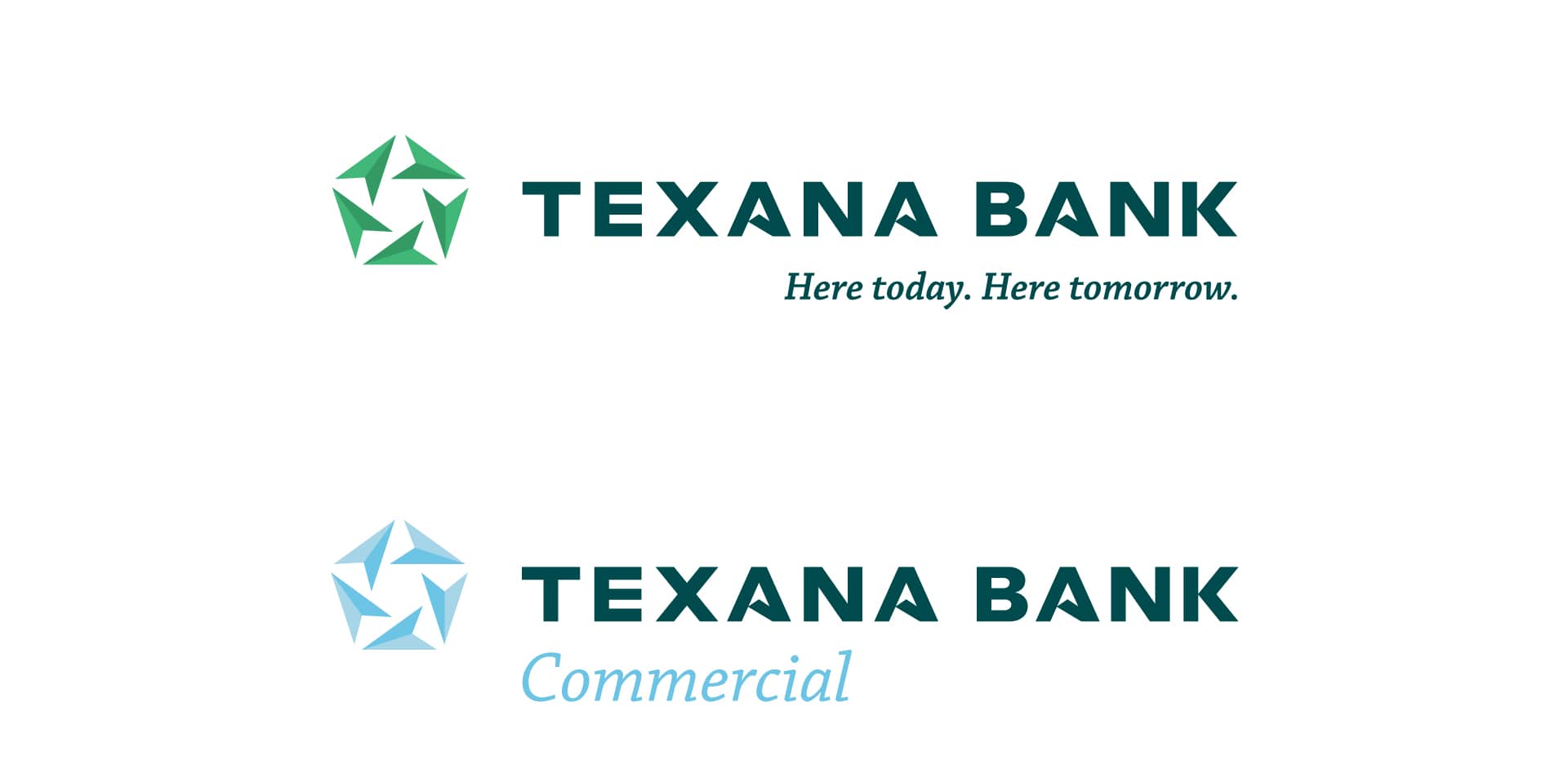
Texana’s new logo serves as a centerpiece for the bank’s entire new brand. The graphic draws the eye to the star in its negative space, a tribute to the bank’s deep Texas roots. Simultaneously, the arrows forming the star communicate that Texana is constantly thinking about how to better serve the community.

It was vital to convey the bank’s reliability and capability while also looking sharp and working hard. And, internally, the brand needed to be something employees could rally behind.
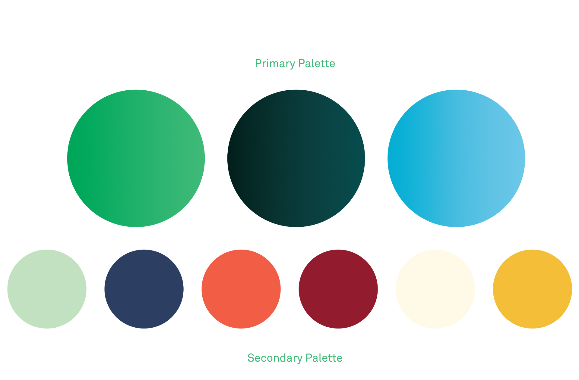
Texana’s color palette is simple, employing soothing shades of green and blue. It communicates a bank that empowers its customers to manage their finances without fear. Texana isn’t just a resource, but a helpful hand navigating the complicated world of banking.
The result is a bank that’s up to date but not trendy, capable but not corporate. A bank that’s here today and will be here tomorrow.