Skip to Content
About
Our Work
Blog
Let's Talk
01
Home
02
Our Work
03
About
04
Blog
05
Careers
06
Let's Talk
Back to Mabus Agency
Ready to work with us?
Nav Contact
Name
(Required)
Phone
(Required)
Email
(Required)
Bank Needs
(Required)
CAPTCHA
Name
This field is for validation purposes and should be left unchanged.
Join the best
Are you ready to join the best bank marketing team on the planet?
See Job Openings +
71 S Green St, Tupelo, MS 38804
662-823-2100
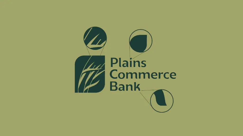
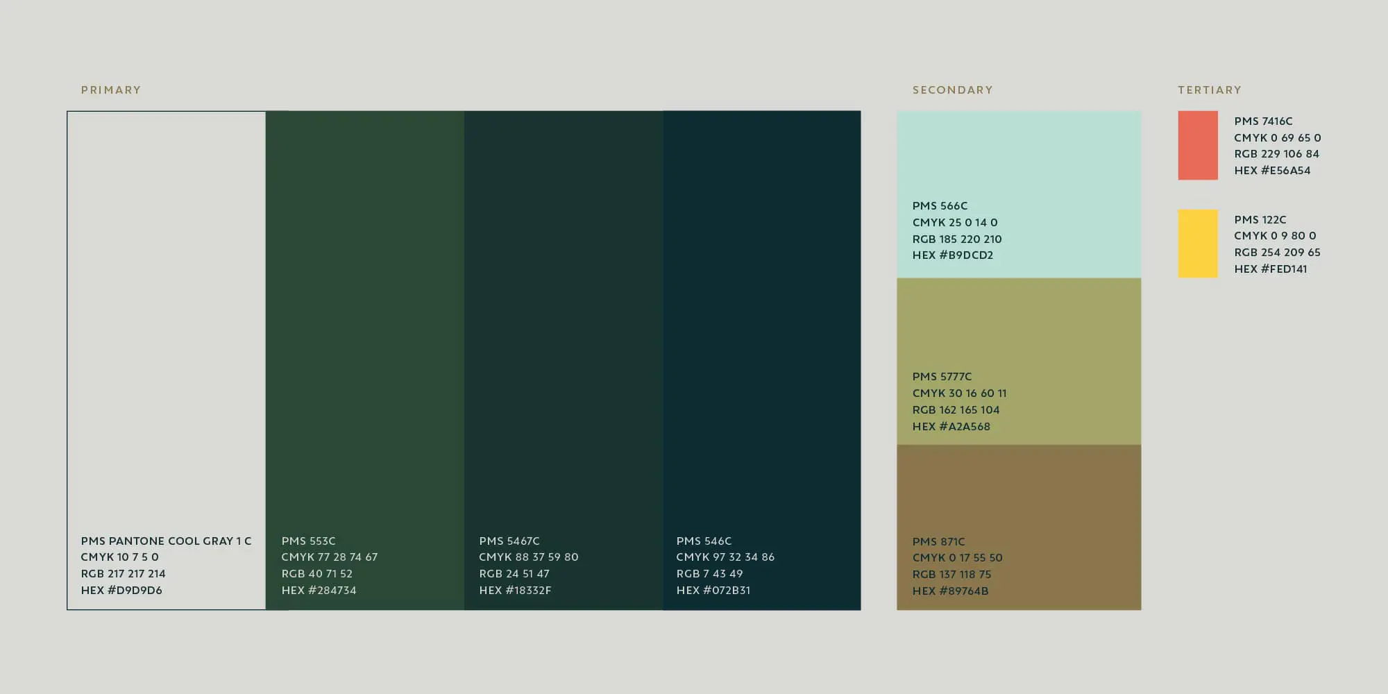
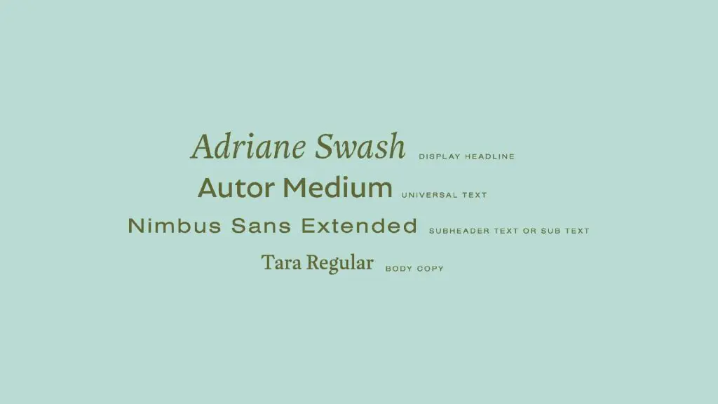
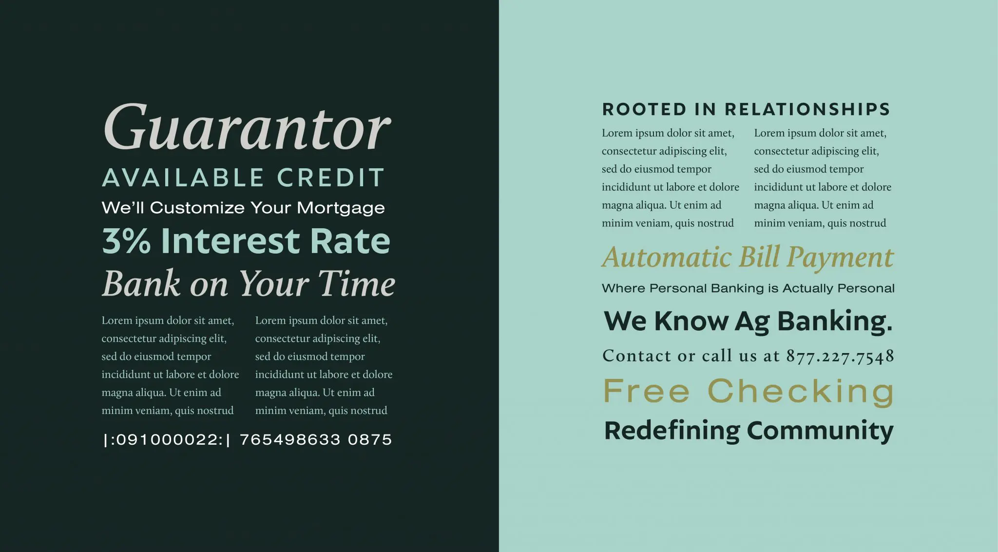
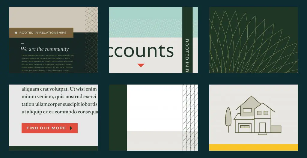
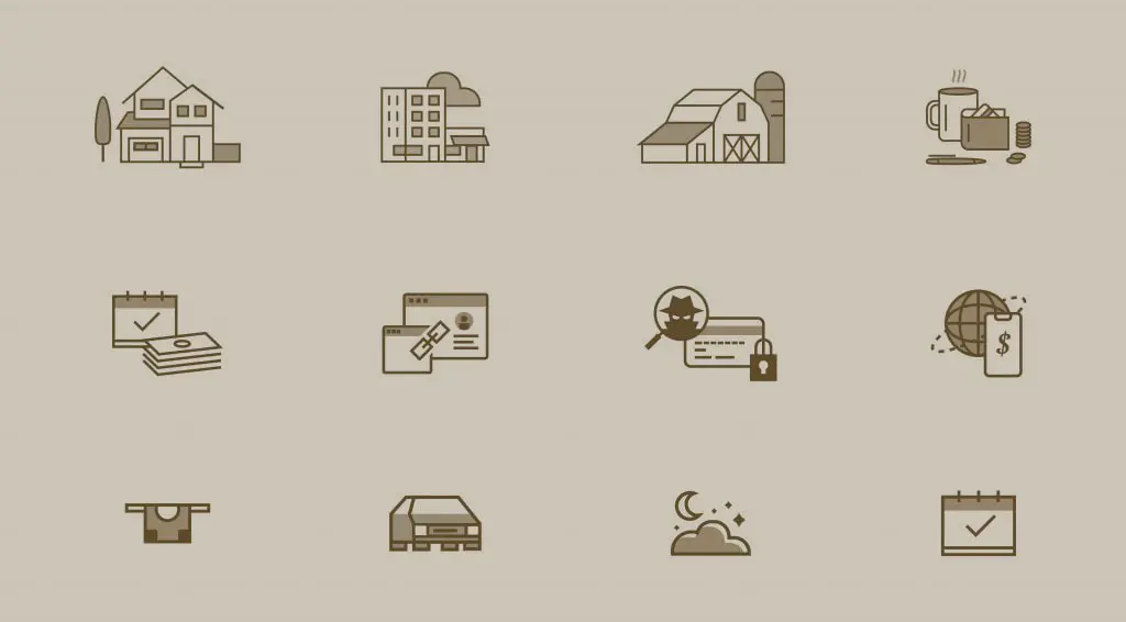
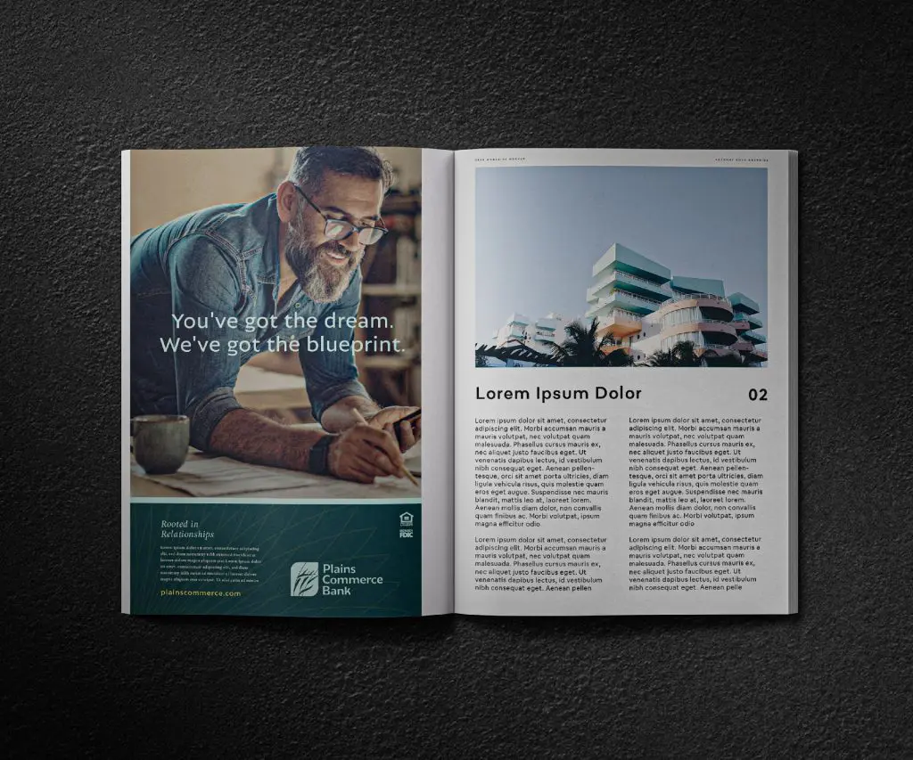
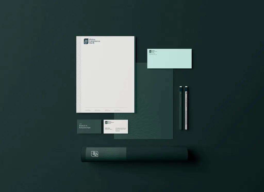
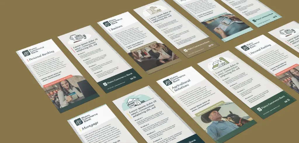
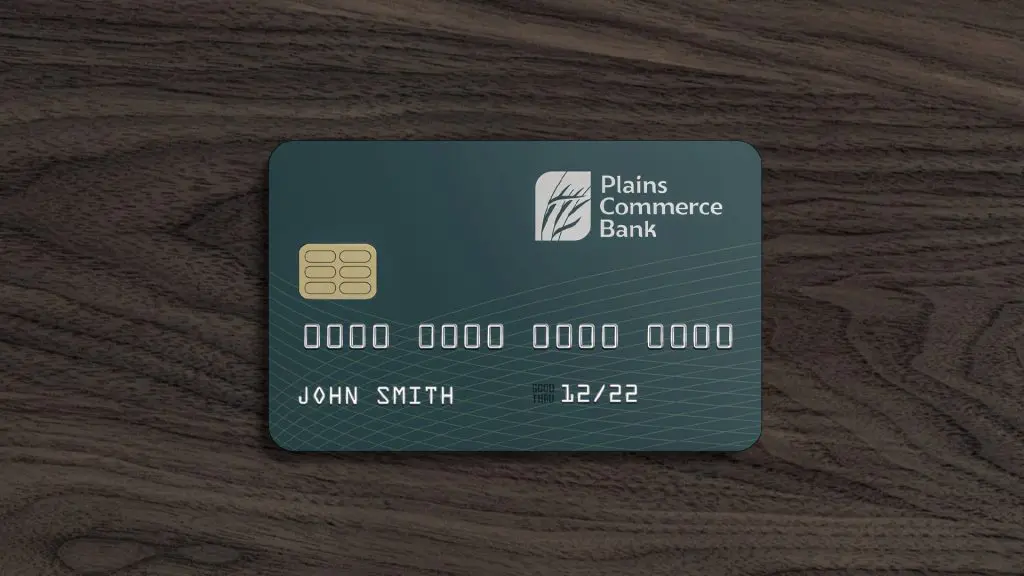
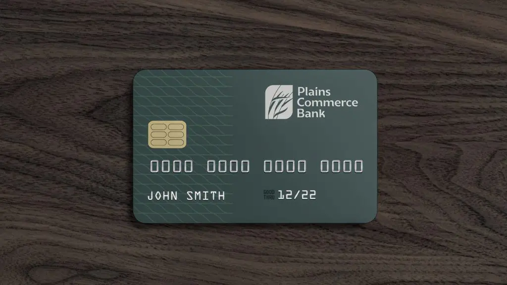
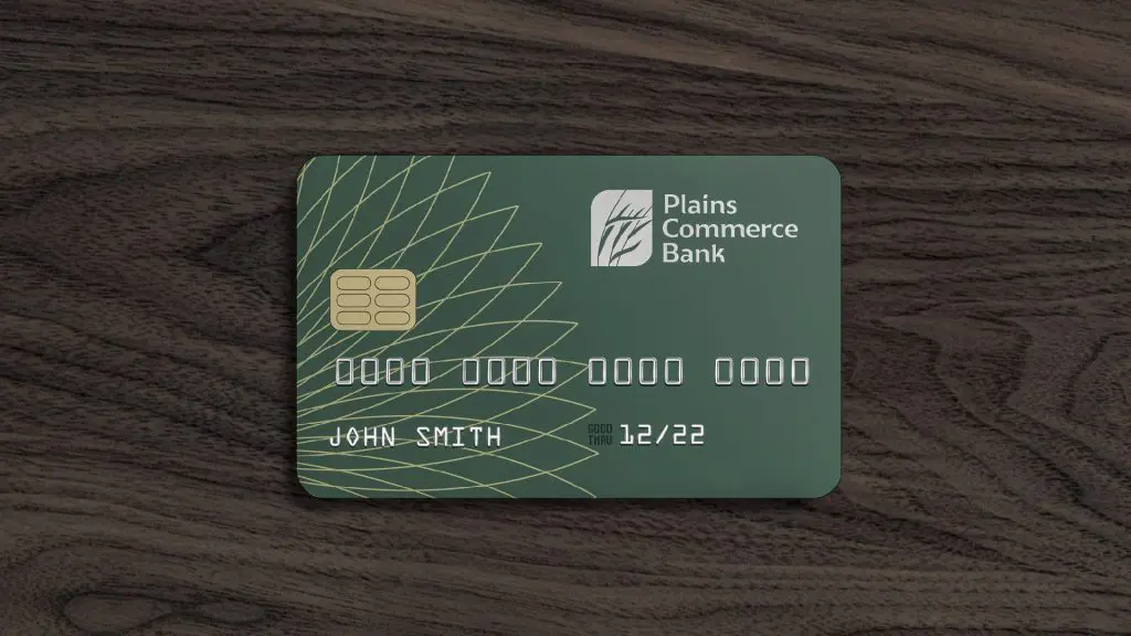
Plains Commerce Bank // Brand Expansion