Contact Us
Ready to Talk?
HOW CAN WE HELP YOUR BANK GROW? LET US KNOW, AND ONE OF OUR TEAM MEMBERS WILL REACH OUT TO YOU TO LEARN MORE ABOUT YOUR BANK, YOUR CLIENTS, AND YOUR NEEDS.
Ready to talk?

Brand
Ready to talk?
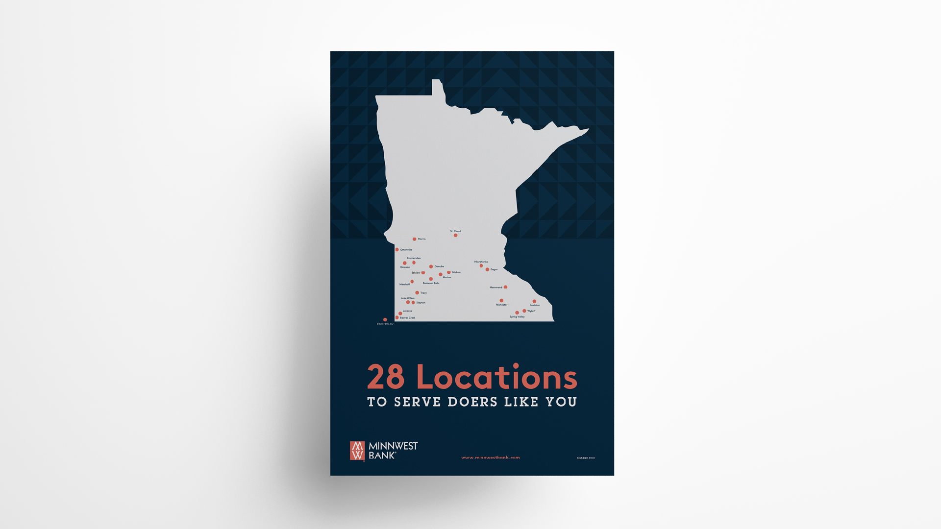
Minnwest Bank’s brand captures the essence of rural Minnesotans, small business owners, and community-minded clients who identify as “doers”—hard-working people willing to put in whatever work is necessary to get things done. We jumped at the chance to enhance this identity, this feeling of empowerment, by adding all the elements it needed to exist in a digital space.
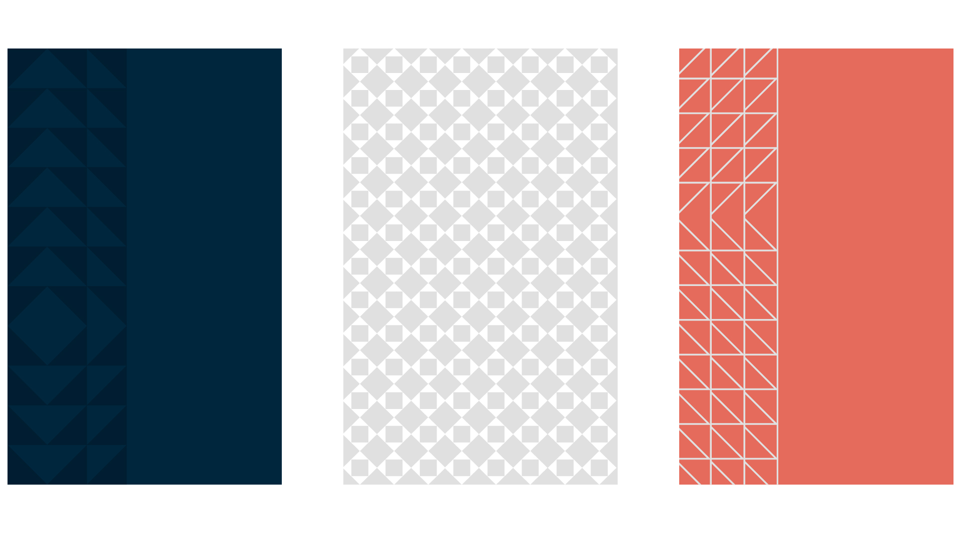
Our designers created several custom patterns that work hand-in-hand with Minnwest’s logo to conjure a more modern sense of style and texture while acknowledging the bank’s deep history of serving the agricultural community or rural Minnesota.

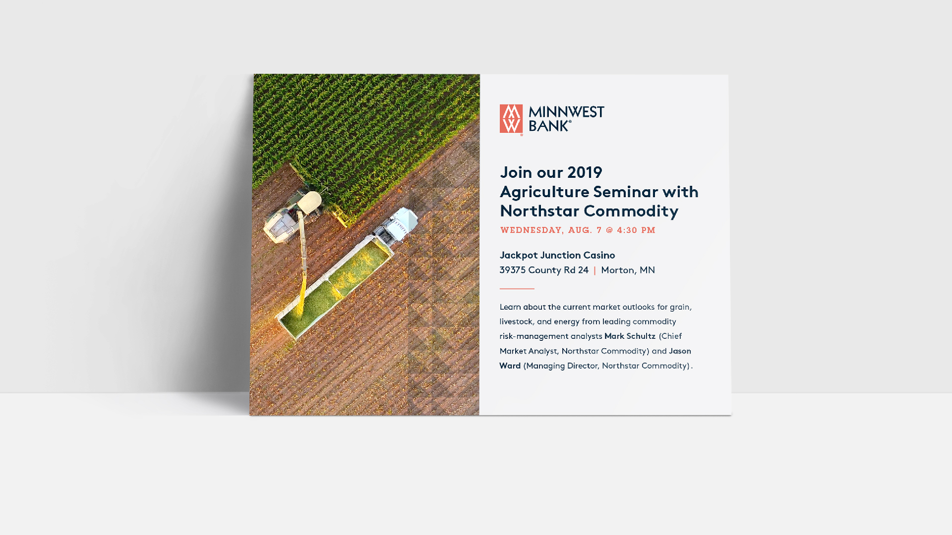
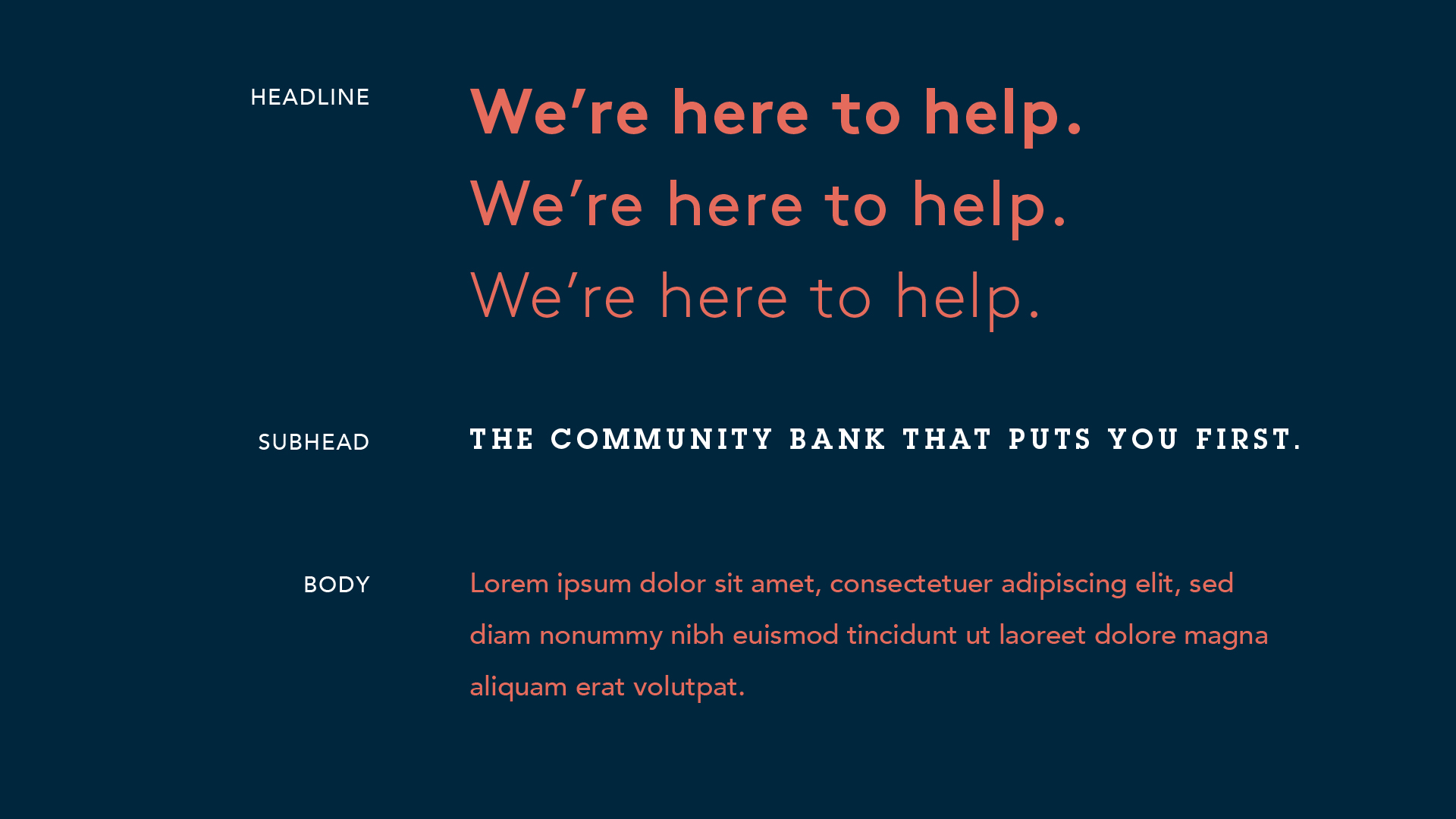
Building upon the typeface used in the existing Minnwest logo, we expanded its library to include sans-serif headline and body typefaces that can be easily read across all media, with an emphasis on clarity and boldness that alludes to Minnwest’s long history of stability within its footprint. Our serifed subhead text contrasts nicely, adding elements of power, emphasis, and tradition to short, direct headlines while serving as another nod to the bank’s rich agricultural history.
With a robust brand toolkit, Minnwest Bank is ready to take on any application the marketing strategy requires, whether in branch, in print, or online.