Is Your Landing Page Leaking Customers?
You spent time building the campaign. You finally got budget approval. You negotiated the media buy. You crafted a compelling CTA. You finally got the click—the hardest part.
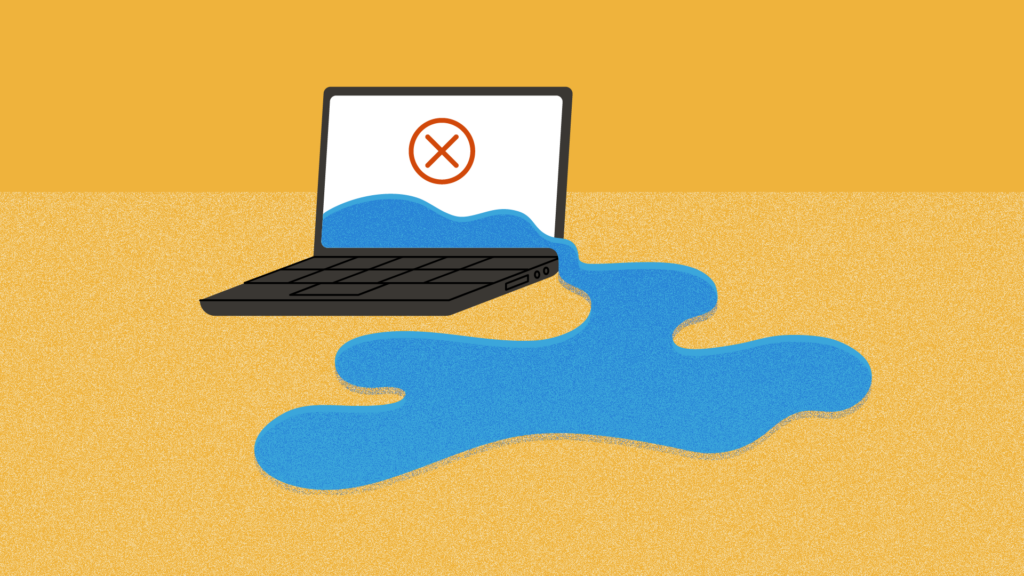
And then you lost them.
Not because of your ad.
Because your landing page wasn’t ready.
Bank landing pages fail for one of two reasons. Either they try to say too much, or they say the wrong things. Both leave potential customers confused, unconvinced, or overwhelmed. And that means they bounce.
Let’s fix that.
Your Landing Page Has One Job
Landing pages aren’t brochures. They’re not homepages. They’re not “about us” pages with a conversion form tacked on.
Your landing page should do two things: reinforce the promise that brought someone there in the first place and give them a clear, compelling path forward.
If your ad offers a high-yield savings account, your landing page should finish that sentence—fast. Don’t waste space reminding visitors what your bank does. They already clicked the ad. Your job now is to help them say yes and make opening an account easy.
The Worst-Performing Landing Page Is the One That Doesn’t Exist
If you’re still sending traffic to your homepage, you’re making the visitor do all the work. You’re introducing friction instead of offering clarity. You’re increasing the odds they bounce before they ever learn what you offer that could be relevant to them.
Sending someone to your homepage is like putting a billboard in the woods and hoping someone finds it, reads it, and then goes looking for more.
Start building the landing pages your marketing deserves.
The Most Common Mistakes on Bank Landing Pages
Let’s talk about the usual suspects that quietly sabotage conversion:
1. Everything Above the Fold
Many banks still believe everything important has to appear at the top of the page. So the instinct is to cram headlines, forms, product details, branch hours, and legal disclaimers into a single screen view.
It doesn’t work.
You’re not optimizing for conversions. You’re overwhelming people. A great landing page invites interaction. It gives the visitor room to breathe and a clear reason to keep scrolling if they haven’t been convinced yet.
Above-the-fold content does matter, but it’s just the start of the conversation, not the whole script. Use it to confirm the promise that brought them there, not dump every detail.
However, there is one thing that should always appear above the fold: a clear way to take action.
Not because everyone will convert instantly, but because some already want to. If they’re ready, don’t make them hunt. Give them a simple, obvious path to become a customer.
2. Generic, Me-First Copy
If your headline is “We’ve Been Serving Our Community Since 1902,” congratulations: you’ve written a museum label, not a conversion driver.
Try this instead: “Earn 5.25% APY on balances over $1,000—Open in Minutes.”
You’re not trying to win a branding award on this page. You’re trying to win business. Save the origin story for your “About” page. Use your headline and subhead to prove value to the visitor in under 3 seconds.
3. Visual Clutter
Your landing page isn’t a design playground. It’s a decision-making tool.
Use clear visual hierarchy:
- A strong headline (above the fold)
- A scannable value proposition (what you get, who it’s for)
- Relevant, reassuring detail—like how long it takes to open the account or how soon funds are available
- A clean CTA button (not buried under a paragraph or hidden in a menu)
And while trust does matter, don’t get hung up on vanity badges. You don’t need to show off a 4.8-star app rating or invent fake security icons.
Instead, reinforce credibility with useful information:
- Tell people they can open the account in minutes (or don’t if it’s a longer process)
- Mention real-time support if you offer it
- Show the first few steps of the process so it feels transparent
If your site already includes the FDIC disclosure near the logo (as required), don’t duplicate it.
The Landing Page Is a Continuation of the Ad
One of the most damaging mistakes we see: landing pages that feel disconnected from the ad that brought the user there.
If your ad says, “Switch to a better checking account,” but the landing page primarily talks about digital banking tools and overdraft protection—without ever referencing switching—then you’ve broken the flow. The customer’s brain starts asking, “Am I in the right place?”
This is what we mean when we say your ad and landing page should feel like the same conversation. Think of it like walking into a store after seeing a sale sign. If the clerk greets you with a totally unrelated pitch, you’re thrown off.
Continuity builds confidence.
Don’t Dump. Guide.
You’ve heard us talk about the Inverse Triangle. The idea is simple: Don’t try to marry someone on the first date. Don’t ask for everything up front. And don’t assume every visitor needs every detail right now. Inverse Triangles work because people only want detail once they’ve decided they’re in the right place.
Your landing page should follow this basic progression:
- Capture attention with a promise (headline)
- Reinforce that promise (subhead or short paragraph)
- Provide clarity (benefits, eligibility, time frame, requirements)
- Offer a next step (CTA or form)
Think of each section as a chance to pull the customer deeper. If you try to deliver everything at once, most people won’t dig through the mess to find the one thing they came for.
Structure Matters—Here’s a Simple Layout
Here’s a basic structure you can reuse for any product landing page:
- Headline: Directly restates or strengthens your ad message
- Subhead: Explains the value in 1–2 sentences
- Visual: Use a single, simple image that reinforces the offer—not a just an overused stock photo of happy people
- Key Benefits: 3 bullets max. Lead with what matters most.
- Relevant Details: Time to open. Minimum balance. Special eligibility.
- Call to Action: Big button. Single action. High contrast. “Open an Account” or “Get Started”
Use whitespace. Guide the eye. Keep the journey short.
Use Healthy Redundancy
Repeating yourself is a strategy, not a mistake.
People don’t read web pages top to bottom like a book. They scan. That means you can’t rely on a single CTA at the bottom of the page. You need multiple entry points.
Reinforce your message. Repeat the offer. Repeat the path to convert.
And don’t assume everyone wants to open their account online. Some visitors want to visit a branch. Others never want to step foot in one.
Offer both options—clearly.
A simple line can go a long way:
“Open online in minutes or visit any of our 12 locations.”
Don’t force one experience. Give customers the power to choose.
Let’s Talk About CTAs That Solve Problems
Your call to action isn’t just a button. It’s a promise. A great CTA doesn’t just ask the visitor to act. It shows them what problem you’re solving.
Compare these:
- Bad: “Submit”
- Better: “Open My Account”
- Best: “Start Earning Higher Interest Today”
Each level gets more specific, more helpful, and more likely to convert. Because it’s not just about doing something—it’s about solving something.
CTAs should function like decisions, not demands.
Every Click Deserves a Clear Destination
You already did the hard work. You got the attention. You earned the click. Don’t let the trail go cold when it matters most.
Landing pages aren’t bonus content. They’re where your marketing becomes real. They’re where curiosity turns into action. And when they’re done right, they make the entire customer journey feel seamless, smart, and satisfying.
So take a look at your campaigns. Then take a look at where they lead. Are you guiding people to what they need? Or just hoping they figure it out?
You don’t need perfect pages. You need purposeful ones.
You already did the hard part.
Don’t lose them where it matters most.