

Ready to talk?

Strategy

Brand

Video
Ready to talk?

Plains Commerce Bank came to Mabus Agency wanting something more. The South Dakota-based bank’s brand had served them well. But they knew it was up to them to outpace an ever-changing world.
Conversations revealed key opportunities around a logo that hindered the bank in its usage, a well-defined visual style, and focused messaging. Plains Commerce gravitated to Mabus Agency’s honed brand focus supported by an expansive library of useful visual and messaging elements.
But this wasn’t a wholesale change. Plains Commerce Bank has served its communities in the Dakotas for more than 80 years. The bank’s dedication to its customers proved out over those decades, and its name was important. Together, we decided an evolutionary path was best. The challenge was clear: energize the branding to better communicate how Plains Commerce Bank serves its customers—now and into the future.

The original Plains Commerce logo had a unique, organic quality that conveyed a sense of movement. Yet, the hand-written “plains” created issues in legibility and evolved into the largest part of the logo. This visual hierarchy had to be changed. We chose a more reserved approach—customizing type from the ground up to create a truly unique wordmark. Every detail of each letter was carefully crafted to provide uniqueness while remaining highly usable and legible.
More nuance improved the logo icon itself. The grass of the plains is an important visual but was captured in an uninspired container. We matched the fluidity and motion of the organic elements with a more interesting container. Also, we used negative space to create depth to match the motion of the grass. These simple changes create a world of difference in the visual sophistication of these elements, and all combine to make a greatly improved cornerstone to the overall brand.
The grasslands of the Dakotas are incredibly important to the region’s ecosystem and economy. These don’t just create beautiful vistas but also provide grazing for ranchers and stability to the soil.
Similarly, Plains Commerce Bank knows its relationships with its customers—its ability to understand them gives them leverage to provide unparalleled service.
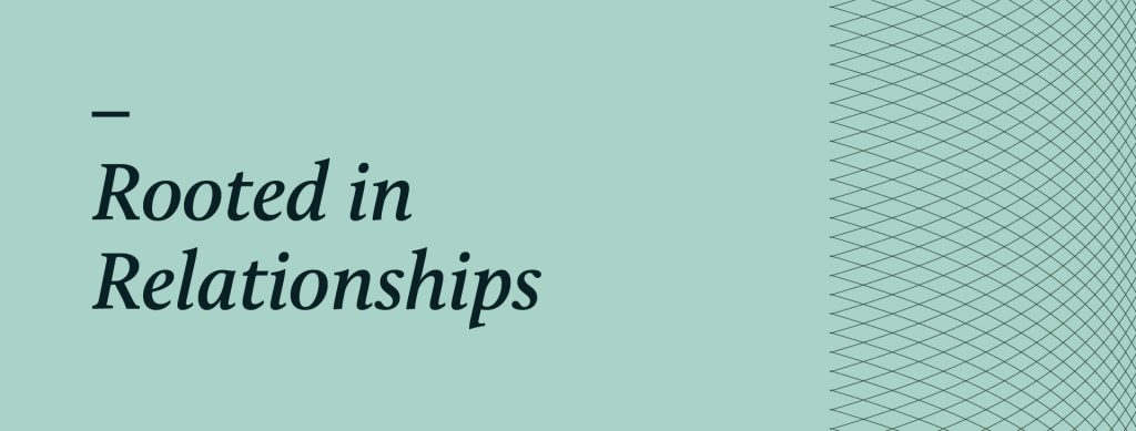
“Rooted in Relationships” nods to PCB’s identity as a community bank and communicates stability, strength, and longevity. It conveys the bank’s honest, down-to-earth approach. It captures the “Why” that drives PCB to go above and beyond.
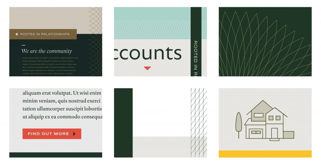
A brand is much more than a logo. It even expands beyond messaging. At its core, a brand is the feeling—a perception. Our job, as a branding agency, is to embody and communicate the sense of Plains Commerce Bank to its audience. Below we will explore the individual components utilized to bring the brand to life.
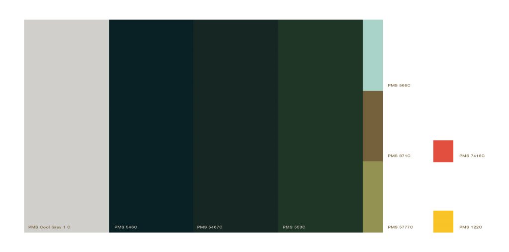
Color has important ties to emotion, mood, and perception. While we have just a few primary colors, these combine to create a near-infinite gamut. Choosing a set of colors that represents a brand is a task rooted in science and art.
Uniqueness must balance with appropriateness. We must communicate a central feeling while affording ourselves an ability to grab the audience’s attention or direct their focus.
In this case, we moved the palette from a corporate blue to a more grounded earth-tone palette. It is reserved yet bold. This color set embodies much about how the bank and its clientele approach the work around them. Also, we added purposefully chosen accent colors—to be used sparsely and intentionally. These all work together to support the design and messaging in subtle yet integral ways.
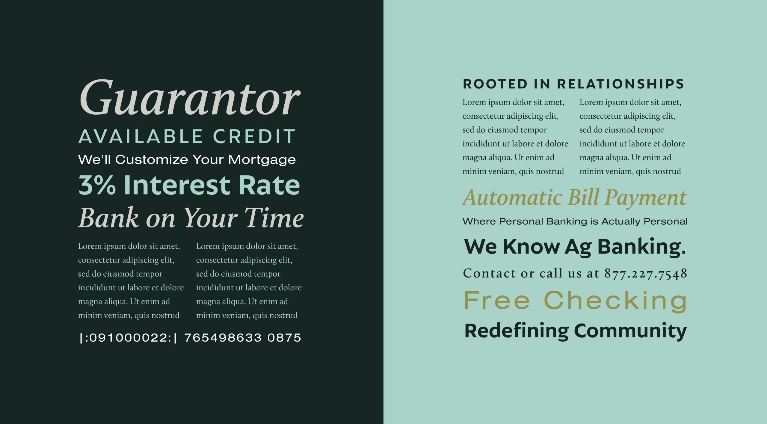
Brand is largely about planning. We determine how pieces work together at the outset to make design decisions easier and more efficient throughout the life of a brand. Typography focuses on blending the correct fonts and determining their relationships and hierarchy. With all our bank clients we want to provide flexible and useful systems. In type, that includes guidance in how to use the components in new ways to maintain brand integrity between touchpoints without being homogenous.

Great brands possess depth. We view pattern as part of this—and use it to great effect for our clients. Plains Commerce Bank’s set of patterns evokes natural, organic elements—combined with structure to incredible results. These patterns draw inspiration from Dakota farmlands and ground the concepts with guilloche etchings found in currency. They point the viewer toward intricacy while also encouraging consciousness of the bigger picture. In application, these patterns can be expanded, repeated, and layered in endless combinations.
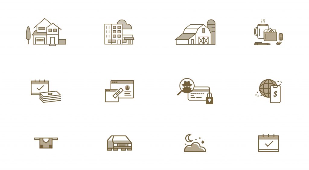
We crafted icons to represent each line of business at PCB, creating them to perform exceptionally within the context of PCB’s renovated brand. These icons are simple enough to work in small sizes but complex enough to function at larger sizes as well.
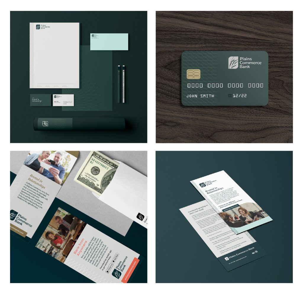
Brands come to life when the components blend in real-world usage. From debit cards to cash envelopes to ads and brochures, Plains Commerce Bank uses its components to form strong brand connections while maintaining interest between pieces.
