The term “content” is thrown around a little too loosely and generically. Some think it just means written words, and it’s all the same. But content is multifaceted—it has layers. Your content is anything you create. It follows a rhythm. It earns attention before it earns trust. And it respects the natural order of how people explore. This is your opportunity to improve and outperform your competition.
They approach content like a one-shot deal—say everything all at once, and hope something sticks.
But, imagine for a moment that you’re single, looking to go on a date. You’re grocery shopping and you meet someone who perfectly matches any superficial parameters you might have. He/she notices you noticing him/her and seems interested. You work up your courage, walk over, and say “Will you marry me?” Then you spend the next two to three hours relating your deepest, darkest secrets.
Totally inappropriate, right? (I hope you agree. Otherwise, this isn’t the article for you.)
So why, then, when we’re writing copy for our banks, do we try to dump all the information we can on a viewer of our ads or visitor to our website?
It’s a tendency that seems a bit more natural when you have this mindset:
“They showed interest!”
“This is our only chance!”
“Show it ALL to them!”
“We won’t get another chance!”
Much like the earlier, hyperbolic example, the “interested party” probably won’t stick around for long.
There is an appropriate order to conversation. A deep understanding of this order can help you create more engaging content that draws people in instead of running them off.
A few years back, I created the Inverse Triangles of Content.
The triangle on the left is a standard visitor funnel. It assumes that you will experience a drop-off in traffic as visitors dig deeper into your materials. But that’s not the whole story. My personal breakthrough came when I began comparing content to visitor drop-off. The depth and breadth of content is represented by the triangle on the right.
As I teach this to my staff, I break both triangles into three levels. You might have many more than three levels, but let’s stick with that. Also, for clarity, let’s use your website as an example. But this can apply to ad copy, videos, or almost any content with which you intend to engage an audience.
Level One
It’s the first engagement point with a visitor. It’s also where most of your traffic will occur, thus represented by the largest area of the visitor triangle. But it’s the smallest area of the content triangle. That’s because this is the most superficial area.
This is where a visitor’s gut-check
kicks in:
“Does this place look reputable?”
“Does this look like a bank with which I would do business?”
“Are these the products/services I’m looking for?”
Just as in any form of attraction, there are superficial cues—sometimes conscious, other times subconscious—that give us an internal green light (Go! Go! Go!) or red light (Hold up!).
You should always strive to make your top-level content engaging to a wide audience, but you must also understand that not everyone will dig deeper. You can’t be everything to everyone. But don’t get sad. It’s not a true loss. If you gave the visitor compelling content and a path to dig deeper, you would only lose those who were nothing more than superficially interested (more on those folks later) to begin with.
Level Two
This is the middle ground. It’s the product page or checking account comparison page. If there’s a formal theory around the Inverse Triangles, it would be stated like this: As a group of people seeks more information, the audience will shrink, and it will want information in greater quantity, depth, and detail.
Your superficial visitors aren’t interested in the granular details of each and every checking account. But some of that top-level audience is. The trouble is that you can’t tell which visitor is which. You must give everyone a chance to determine if your information resonates with them, provide a path for them to continue to learn, and continue to give relevant information at the next level.
Curiosity starts to sharpen here. Visitors are trying to place themselves in your offerings:
“What are the specific options available to me?”
“How do these products compare?”
“Which account best fits my needs or lifestyle?”
“What are the fees, features, or benefits I should be aware of?”
You can assume that those who click the “Learn More” button want to learn more. Staging information in this way not only makes a better user experience and customer journey, but it also frees up space to organize information better.
Level Three
Only the most interested and detail-seeking folks will make it here. But you have to give them a destination, since these people might become some of your most dedicated clients.
Their questions become more specific—and more personal:
“What are the exact requirements or qualifications?”
“Where’s the fine print—and does anything here surprise me?”
“What does the account agreement actually say?”
“Do I feel confident moving forward with this bank?”
Also, keep in mind, you’re not hiding information. You’re organizing it. There are folks who are ready to sign up for that new checking account on level one. Don’t hinder them by forcing them to muck through deep information that doesn’t interest them. Give them easy access to the Apply Now button.
Similarly, don’t make it difficult for the person who wants to read the fine print to find it. It’s appropriate to put that deep level of detail under more superficial information.
Your website, ads, etc., are yours. It’s up to you to make a better user flow, even if that means creating new content and new paths from scratch. And again, it’s all about organization
As a group of people seeks more information, the audience will shrink, and it will want information in greater quantity, depth, and detail.
Organization
The example deals with the way content flows from page to subpage. This lesson also applies to vertical organization on an individual web page or ad (which is why you always see disclaimers at the bottom).
The readers’ knowledge grows as they travel the path you set. They’re ready for more in-depth information because of the foundation you set earlier.
Keep in mind, that information can (and many times should) grow in volume further down the trail.
As important as it is to organize the data, I can’t reiterate enough that you’re providing paths. Just as you’re providing a path to go deeper, you must also provide a path to engage/convert. Make certain that you provide the visitor ways to easily sign up for services when they’re ready. Provide multiple ways to convert at each step—even risking overkill.
Because, in the end, all of this is about providing a more comprehensive environment for your audience to find the comfort needed to do business with you.
As a group of people seeks more information, the audience will shrink, and it will want information in greater quantity, depth, and detail.
Compliance
Be sure to have your internal compliance department review your flow. Your team may be a bit more conservative in approach, and prefer to not separate certain components or details. You may also have to add disclaimers to each page that describe the product—which is fine, as long as the page is laid
out properly.
Revisit the Superficially Interested
I hope you didn’t forget about those superficially interested visitors who chose to leave your page.
Never discount the amount of budget required to generate visitors, and never forget that most visitors aren’t convinced on the first pass. At the very least, you must implement a retargeting campaign to serve ads that acknowledge and follow those visitors who were distracted by a Facebook notification and forgot they went to your website in the first place. Beyond that, you can consider building true lead capture efforts around marketing automation and other emailing platforms.
The short version: you’re wasting money if you attract people to your website and forget about those who don’t convert on the first try.
Set the Stage
You don’t have to rewrite your entire website tomorrow. But, now that you know about the Inverse Triangles of Content, you do have to start somewhere. Start with an easy win.
Choose one high-traffic area of your website, such as checking, and plan out the stages that will draw visitors deeper into the product offering.
Make certain you serve the content they need as they go deeper.
Give visitors many ways to convert at any step along the way.
Now you’re ready to build more engaging content across all media.
Maximize Wins and Minimize Losses with a Healthy Advertising Mix
Your bank needs deposits. Everyone from the top down knows it. After a spirited ALCO meeting, the bank agrees to roll out a high-yield CD to bring in the bucks. You get a special budget to create a 90-day campaign with new creative. You pull off the miracle of launching the campaign in the nick of time.

Across town, a person is opening her newspaper, and your ad catches her eye. She’s looking for a new bank, after all. But…it’s for a CD. She owns a business and is looking for a place to move her operating account—that holds about $500,000 on average. Even though she’s unhappy with her current bank, she breezes right on past your ad because it doesn’t fit her need. You see, she needs a business bank.
What’s this? Your bank is also a commercial bank?
Of course, it is, but you missed the opportunity because the mandate was to advertise the high-yield CD.
Ugh. It’s a bit of a gut punch, right?
It’s a mistake you might’ve made (and now you’re probably trying to think of how many times). The ad was too focused—when the business owner in question could’ve put a big dent in your deposit-raising goal with her operating account.
I don’t have a problem with CD ads. I don’t have a problem with product-based promotions. Each has its place in your marketing plan.
But this scenario reminds me of something I heard an old man relate once: “You can bet your bottom dollar I’ll be at the airport when my ship comes in.”
It’s maddening to be given a great product, executed a campaign, and know you still might’ve missed the proverbial boat.
The scenario outlined above plays out at banks all across the country—multiple times every day.
A person is looking for a mortgage when you’re running an ad for your new checking account.
A student is looking for a new checking account and receives a digital ad for mortgage.
Your audience is simply bigger, broader, and more diverse than most banks’ ad campaigns. There is no way to match the perfect ad with precise timing to the exact needs of a potential client.
Don’t despair, though. There is a solution.
Turning Tears into Tiers
Before we dig into the “how,” you must distance yourself from two core fallacies that hold back banks:
❌ The only way to attract a person to a bank product is to advertise that bank product.
❌ You don’t have enough resources to do what you need to do.
You have the distinctly difficult task of promoting an incredibly complex product mix to an incredibly complex audience. If you approach the project head-on, you’ll wind up going in circles. I’m sure there are resources that claim to match exact need with a perfect ad*, but there’s a more reliable technique.
You have to divide your advertising into three tiers:
1. Brand
2. Transitional
3. Product
Tier One: Brand Advertising
The core of your advertising campaign must be based on your brand. Many times we commit 40% or more of an entire advertising budget to this portion. There are two facets to brand advertising: the message and the medium.
“Branding” as a verb is often misused (unless you’re talking about pressing a hot iron to a cow’s backside). Some purveyors of creativity try to convince an audience that a logo or brand can be so good that it “verbs” an audience in some ways. Make no mistake, though, the Nikes, Cokes, and Amazons of the world would still be stuck at the starting gates if not for an investment in advertising that promoted their brands. Neither would their names echo in the vaunted halls of branding if they didn’t spend BILLIONS backing their position. Sure, they’re great brands, but never forget that they bought the affinity they enjoy.
Brand Messaging
You must commit to advertising that promotes your brand position. If you haven’t arrived at this position, check out this piece or just fast-forward and hire us.
The short version is this: your bank is very similar to 99% of the other 12,000-13,000 financial institutions also marketing to your audience. You must find that 1% and advertise the hell out of it.
Consider this Mabus Agency mantra:
The role of advertising is to facilitate word of mouth in two ways:
1. To get people to talk
2. To tell them what to say
That’s the role of brand messaging. You want to make sure as many people as possible add something like this to their daily conversations: “Hey, have you heard of Strong Bank? Yeah, they’re strong. That’s why I do business with them.”
Brand Media
Once you’ve arrived at your message and committed to sharing it, you have to pick a media mix that fits. While there are no hard and fast rules, we do believe there are media that better lend themselves to certain areas of marketing. For brand, television, billboard, and other broadcast media often carry the biggest brand punch.
No one can choose your bank if they don’t know it exists. You must increase awareness of your brand name, and these agnostic, unfocused media are great tools in your arsenal to spread news of your name. Keep in mind, your brand messaging is only part of the whole. We’ll need to layer in other messaging and tactics.
Tier Two: Transitional Advertising
Being a middle child is tough. One exists as a comparison to older and younger siblings. So is the case with the middle child of our brand-tier approach. You probably can guess that Tier 3 (Product) will be pretty straightforward. Like the youngest sibling, Product is often the baby. And, as we’ve already covered, Brand is the eldest—guiding all our actions.
Transitional Messaging
Transitional is just what the name conveys: the space between the two. But it is definable. Transitional ads outline, with more depth, what type of bank you are.
This could be focused down a line of business:
We’re a commercial bank.
We’re a retail bank.
We’re a mortgage bank.
Perhaps it’s more philosophical:
We’re a community bank.
We’re a bank that crusades for a cause.
We’re a bank that supports our community.
Whatever your bank is, you need to communicate that to your audience early and often.
Transitional ads translate what can be esoteric ideas into more digestible principles for your consumer.
And think of this generally—like the examples above. You can be multiple things in multiple media.
Transitional Media
Again, there are no hard and fast rules, but you can concentrate your Transitional messaging pretty easily. Magazines and specialty publications can be a great forum. If you’re an ag bank, look to your farming publications. Business journals can showcase your position as a business bank. While I’m not a huge fan of radio, there are opportunities (especially in ag territories) to match messaging with medium in powerful ways. Another often overlooked opportunity is events. You can sponsor focused events in agriculture, business, and real estate, or you can level up: make your own. It can be a bit tough to pull off, but there’s no replacement for building relationships. Instead of creating advertising to get someone to walk into your bank, create advertising to draw a farmer or business person to a low-commitment event with a highly valuable speaker. You’ll be thanked for your effort, and likely some of that appreciation will turn into business.
Tier Three: Product Advertising
You probably don’t need a lesson here. We’ve all done plenty of this. It’s the safe route. You’ll never get called on the carpet for promoting product. The only other safe option is putting bankers’ pictures in the paper, but we’re not even going to go there.
Product Messaging
As I said earlier, product advertising has its place. That place is using about 20-30% of your budget to sell a product directly. And when I say “direct,” I mean it.
When you have the properly tiered advertising strategy, you can go in hard on product messaging. You have to be a bit more clever than “Open a damn account now,” but not much. This is where you use your features (such as rate, cashback, etc.), but don’t forget to marry these with your brand benefit.
Product Media
You can advertise product in any almost any media, but you won’t be able to get everything you want in the proper mix. I would guess your biggest fear is how thin your budget is getting by Tier Three. Therefore, you must concentrate where you can.
At the end of the day, your success will likely be quantified in product conversions. To that end, pick media that are extremely conversion-centric. Think digital(ly). Digital display and pay-per-click are areas where you can concentrate strong, straightforward brand messaging. Beyond this, you must have landing pages that match the campaign creative, offer, and messaging. Don’t buy digital ads and drop them on your bank’s homepage. Don’t drop visitors on your standard account signup page. Create unique pages that provide continuity and context from the brand that intrigued the person to click.
Lean Into Your Audience’s Knowledge Understanding
Your audience doesn’t know how a bank works (as we explain here), but they do know what a bank does.
This is especially true of those whose need is the most critical. When a client needs a loan or a new checking account, they know they need a bank. And these are the people you need to attract most.
Think about it. When have you heard someone say, “I need a new checking account”?
It’s more like, “My bank’s app has been wonky for the past six weeks. I need a new bank.”
So which bank will they visit?
One Brand to Rule Them All
You must take a second, close your eyes (if you’re listening to the blogcast), and imagine with me: each of these items must be congruent in messaging, tone, personality, color, photography style—in short, brand. They must look alike. They must sound similar. They must match. Keep in mind, though, I said “congruent.” This means in harmony, but not exact. This is called “Brand-Tier.” Each tier must be ON brand, but you can also use the unique attributes of each medium to great effect.
Hyperfocused, Under-resourced, and Overreacting
All banks have limited resources. There never is enough budget to do everything you want. The result is usually a frantic catch-up game.
We need deposits! Marketing shifts all its focus, time, and money to deposits.
Holy cow! What happened to lending? We need loans! Marketing shifts all its focus, time, and money to loans.
God forbid another bank rolls out a competitive rate. Then you’ll chase them.
To stop, you need a plan, and the Brand-Tier approach is one way to do it.
You don’t have to, and shouldn’t, chase.
Because when you’re chasing, you might not lose, but I can guarantee you won’t win.
Footnote: Remember the lesson, “if it seems too good to be true, it probably is.”)
Your client visits your website looking for a mortgage, but has no idea which product fits.
You help them out with a decisioning tool.
A client needs a new checking account and your bank was the first hit on Google (congrats!). Does the Super Saver account fit better? Or the Free Checking plus?

Again, a decisioning tool can help direct this person to the right product.
Decisioning tools are great, helpful components of bank websites. Bank marketers, product developers, and other team members spend incredible amounts of time creating proper flow, question syntax, and scoring to ensure the right outcomes are reached.
There are dozens of third-party consultants who specialize in helping banks set up decisioning tools.
But there’s a problem—a big one—when we focus so much on the decisioning tool as a component of a website.
I see bankers spend an unbalanced amount of time deciphering customer flow through a component of the website without spending that same time and effort on the website itself.
You see, your website is a decisioning tool.
You might spend weeks tweaking your mortgage tool to help someone pick the right product, but how much time did you spend ensuring a potential client reached the mortgage page quickly and efficiently?
Decisioning tools are great. We build them. We even use them. They help your customers find the right loan or choose the perfect checking account for their life stage—but we forget that websites, by their very nature, are a decisioning tool. A decisioning tool shouldn’t just be a plug-in on your website. Your website is a decisioning tool. And while a decisioning tool is usually just an option, your website is the path. It’s encompassing of every option your bank offers.
Where your clients click, when they scroll, when they go back to previous pages—all these decisions are data points that reveal their thinking. Your bank’s entire website is (or should be) helping someone make a decision—from the layout of the pages to the language used to describe products, to the design of the sitemap.
Website Vs. Interactive Brochure
The most common sin we see on bank websites is they’re simply an interactive brochure for the bank. I would wager that more time is spent scrutinizing where the online banking login portal is placed (because Lord knows if you move it 10 pixels to the left, you’ll be inundated with complaints) while the other page flow was just picked up from the last site layout.
Using a website as an interactive brochure is a missed opportunity because the great thing about a website is that it can be nearly anything. It’s a platform from which we can tell potential clients anything, in any way. But most every bank chooses to use a slider featuring the exact same images and text as the brochure or poster next to teller row. Products are listed in typical banker parlance instead of considering how clients think about their banking needs.
We forget that clients don’t seek out bank products based on the product’s name or category. We ignore that clients don’t think about banking products like bankers do.
Clients think in terms of the problems they’re trying to resolve. Your clients don’t want a mortgage, they want a house, and they want help figuring out how to afford one. Your clients don’t know the terms IRA, 401(k), or superannuation (I swear to you this was a top-level navigation item on a website I recently visited). They do, however, want to retire one day, and are terrified of how behind they are in preparing for that eventuality.
Treasury management is the most beneficial and underutilized area of business banking for this very reason. Most small businesses could use cash flow help, but almost none of them are seeking “treasury management” help.
Your website can be anything. Don’t settle for the limitations of a clickable brochure. Create an experience that actually helps your clients.
Click Path Matters
When planning out a website, most bank marketers think about the website in a sitemap—which is technically how websites are organized. But, in looking at a sitemap, it’s key to think about a click path. A click path is the journey a client takes to find the information he/she is seeking.
How does a client get to the information they want?
Examining possible paths a client might take is a valuable opportunity to introduce products while providing clients more value. Sure, fewer clicks between the home page and the information they need is a good policy, but never forget you have the ability to create a journey for your client.
Think about a grocery store. You know where the milk is, and it’s easy to get there, but it’s not the first thing you see, and the store’s management has laid out a series of items for you to see on your way. Some of those items are “have you thought about getting one of these” items and don’t necessarily go with milk while others are a no-brainer, “while you’re getting milk you should probably grab some of these” items, like cereal, or Oreos.
The real missed opportunity is when we forget to use click path data to inform future decisions and future journeys.
For instance, when a potential client visits your site for the first time, we don’t know anything about them, so we should probably just show them the more popular products and enticing offers. Now, if that potential client selects the business checking page, we can safely assume this person has a business or manages a business’s finances and then serve them content about some of our related bank products, like cash flow assistance or sweeps accounts.
The paths we create for clients to follow are key to the success of our website, and thanks to the speed with which web technology has developed, it’s easier than ever to monitor traffic and serve clients more meaningful content.
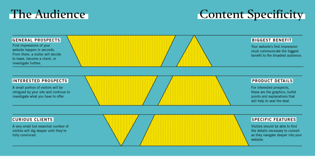
Inverse Content Triangles
Now that we’re creating a journey for a client, we must remember that some people will be convinced quickly while others want to do extensive research. If someone is ready to make a decision immediately, we need to give them the option. At the same time, we need to answer all of the questions a more curious prospect may have.
As the audience dives deeper into your site, it shrinks in size. This shrinking audience seeks broader and more specific information as they dig.
We visualize this with the inverse triangles of content. The largest number of people will visit your home page. A lesser amount of people wants deeper information. Too many marketers short-circuit this system by putting everything (and the kitchen sink) at the top of a product’s landing page. Once you understand that an audience culls itself as it seeks more specific information, you can organize your information in a more valuable flow.
Your first layer of information is striking, engaging, and relatively shallow. You must quickly engage your visitors by confirming they’ve reached the right place. Some of your audience will sign up right there—at the top level. A smaller amount needs more information. As they drill down, you can offer more information. Your second level explains the variety of checking products. Your third level can give detail on the offerings of each.
How can you create a system that wins in both scenarios (and the spectrum in between)? This has a lot to do with the previous section—click path—as well as content structuring and page layout.
By leading with the most compelling and concise information, we can not only cater to the larger number of people reading but also attract more readers to the page. Leading with a more compelling benefit compels the reader to continue engaging with the product. Those who need the most information will expend the extra effort to continue clicking, but only if it is apparent that the information expands as they click.
Always Give a Way Out
No matter how valuable of a journey you create on your bank’s website, someone will want to navigate at their own pace. You must provide visitors with a way to navigate through your bank’s product pages, content, and portals at their own pace—even if you’ve created a superior decisioning experience. They also need to be able to move laterally through your designed click path. Maybe they want to see something again on a previous page. Maybe they want to skip ahead to make sure this is the right path for them.
We call this “healthy redundancy”—having many entrances and exits from each page, especially with a mind toward related content. No matter how good your designed journey is, be sure to give your clients freedom to create their own journey, too.
Get Started (Challenge)
Before you can begin the process of designing an intentional customer journey through your website, you need to account for what your website experience looks like now. Try this:
Find a mind-mapping software you like (we like the free account at Lucid Charts and the paid account at Miro) or grab a really big whiteboard with lots of colored markers.
Map your website out by hierarchy of information—like a family tree. Your home page should be in a box at the top of the page, on a line by itself. From there you may diverge into personal or business pages. It varies from site to site. Most banks have sitemaps that are considerably wider than they are tall, but the goal is for your sitemap to look a little more like a Christmas tree. And within that Christmas tree, you want to have pages that work as a shortcut from the top to the bottom or from the far left to the far right.
- Draw out your current sitemap. Does it offer a narrative path, or is it simply a collection of loosely related pages?
- Can you think of ways to begin grouping pages and products that will make your website easier for a consumer to navigate?
- Instead of grouping your products by department or product types, draw a hypothetical sitemap that takes clients through the page according to their life stage.
Each click, scroll, and pause is a decision—a decision to stay, leave, or go deeper into your website. You’ll never help a client pick the right mortgage if you can’t get them to the mortgage page. Your website IS a decisioning tool. Make sure you build it so clients decide to stay.
A Rebrand Strategy That Won’t Leave You Reeling
No time to read? Listen to an audio version of this blog below.
There are two kinds of banks: those who get to rebrand and those who don’t. For those who get to initiate a new brand, it’s one of the most exhilarating (and scary) projects you’ll undertake. The entire future of an institution is your responsibility and there are only two options as to how it will turn out: great or terrible. There is no middle ground.
If things go well, you might be looking at a promotion (or another bank looking to snatch you up to help them rebrand). If things go poorly? Well. You might be getting the boot.

There’s a bigger problem, though: It’s almost impossible to immediately determine which way it will go.
Rebranding has an almost supernatural reputation. We talk about capturing the essence of an organization or the spirit of the brand. It’s intimidating. It sounds like you need a medium or a spirit guide, or at least, an Ouija board.
For most, any rebrand is their first.
We want to help you through all the prognostication and soul searching, but we’ll skip the Ouija board and hopefully demystify the process.
That doesn’t mean we can remove the fear. The best analogy I can give for your first rebrand is a bit like skydiving. If you go on a legit excursion, the instructors will spend far more time on the ground training you than actually plummeting from the sky. All of that instruction doesn’t keep you from being scared when you poke your head through the door and see 13,000 feet of nothing separating you from the ground. Having a qualified expert strapped to your back doesn’t keep your heart from racing. But, at some point, you have to jump. When you have to take that leap, we want to make rebranding a little less nerve-wracking.
START WITH THE WHY
Everyone, including wet-behind-the-ears interns, quotes from the gospel of Simon Sinek. Common knowledge doesn’t make it bad knowledge. And that’s the case with Sinek’s number one commandment: Start with the why. So let’s start there. Why rebrand?
The two most common and pragmatic reasons banks rebrand are geographic expansion and mergers.1
The First Bank of Smith County doesn’t make much sense when you expand into Carrol County.
It gets a bit more complex with mergers and acquisitions. Sometimes banks find that their name conflicts in a newly expanded footprint, or you run into the same geographic issues mentioned above. Other times, banks take advantage of the upheaval to create a stronger name or identity.
If this is your “why,” it’s tempting to react with a simple modification. We are now the First Bank of Smith and Carrol Counties. That’s not getting anyone into the branding hall of fame.
Perhaps everyone finally noticed (and agreed) that your colors are outdated or your logo is just ugly. Then your “why” might be aesthetically based. In this case, the easy part is agreeing to change. The hard part is when someone wants to pay homage to the old brand—worried that the audience won’t recognize you. This is a valid fear, one that should be explored, but too much energy can easily be expended on this effort. Too many banks wind up compromising. This is when First Bank of Smith County becomes FBSC.
Let me be clear. This is a bad idea. Please do not be tempted to go into the middle ground of abbreviations. These attempts to hold on to the past (that your clients probably don’t even care about) normally leave you with no brand name at all. Sure, you can cite UPS, GEICO, or AT&T as examples of successfully abbreviated companies, but I doubt your bank wants to spend the BILLIONS of dollars each of those brands spent over years to attain their status. These examples only prove that one can be successful with an abbreviated name. It doesn’t mean you should.
When you rebrand, you can be anything. In the earlier example, the initials FBSC don’t communicate anything. There are many clever ways to uphold existing brand equity and pay homage without reducing yourself to a set of letters that can’t recall any connection to their roots. Want to test it? Without internet search, can you immediately recall what UPS, GEICO, and AT&T abbreviate. Even if you got them right, do you associate their expanded names with what makes these companies successful?
Often your reasons for rebranding are most important to you and your colleagues and often less relevant to your audience and clients. Your reason for rebranding should help inform your rebrand strategy, but it should not necessarily be your rebranding strategy.
Your true “why” has to be deeper.
No matter the predicating factors, you should be rebranding to make a stronger identity. Brand is the foundation of all marketing efforts that will follow. Brand is the fulcrum that helps you with all the heavy lifting to come. If your name and logo are unique and memorable, earning name ID and top-of-mind awareness will be easier and cheaper. A strong brand message can reduce your advertising cost because word of mouth will be easier to create.
Brand strength is your goal. It’s your why. Now you’re asking “how!?” We’ll get there, but we have to ask “who?” next.
WHO IS THE BRAND FOR?
Everything in branding comes back to audience. The better you understand your Who (your audience) the stronger and more successful your rebrand will be. Think about who your rebrand is for. The good news is that most marketers overcomplicate audience. We’re going to help you simplify it.
Before you dig deeper, you need to pick between two audiences. Are you rebranding for your current clients or potential clients? It’s never an equal split between both. And, spoiler alert, it should lean toward potential clients.
Can you rebrand for new clients without alienating your constituents? Yes.
And the answer is so easy we’re not going to expound very much: Just communicate with them. Unless you drastically changed your core offerings, how you do business, or moved a headquarters, you’re probably not going to lose clients—if you communicate the changes with them.
Now that we know there are two groups, let’s add a bit more detail to help guide your efforts.
- Ugly/Outdated Brand — Gone are the days of one community bank competing with another. Even if you’re one of two or three banks in town, you’re competing with national sentiment. In other words, if your brand doesn’t look like it could compete with a national brand, it could be diminished in your audience’s perception. Potential clients will judge your ability to fulfill a mortgage by the intelligence and sophistication of your marketing, and that is based on your brand.2
- Forgettable/Confusing Brand — This is similar to the example above. More than two-thirds of banks share a similar name. This similarity comes from shared mundane terms such as Citizens, Farmers, First, National, etc. There’s a lot of competition for your clients’ headspace; if they don’t remember your brand, you’re not going to convert them.
- Misleading/Alienating Brand — Do you ever wonder why certain clients only have one product with your bank? It could be because they think of your shop as a business bank/ag bank/retail bank, instead of a full-service financial institution. You don’t want to spend money perpetuating that to a broader audience. Perhaps your name is too rural, urban, traditional, modern, etc., so potential clients assume it is not for them. It’s hard to be surprised when Merchants & Farmers is not raking in the retail DDAs when no one refers to themselves as merchants and you already have all the farmers’ business.
“Why” and “who” combine to make up the foundation of a great brand, but we have a few other questions to consider.
What . . . ?
What are we even doing? What’s on the table? What about the logo? What about the name, tag-line, and market position?
It might sound ridiculous, but I can speak from experience: I’ve seen rebrands fail due to the fact that no one agreed on which component could (or should) change.
When there’s a sacred cow—i.e., “the logo is off-limits, but change everything else”—it’s usually due to internal politics. Other times, it’s lack of communication.
Go back to the why and be brave enough to make a firm decision. Let that inform the rest of the process. When someone is stuck on brand equity of a generic name or says, “we can’t touch the logo,” it might be time to hang up the process. A 60 percent rebrand doesn’t yield 60 percent of the results. In fact, it usually has negative returns.
WHEN ARE WE READY TO ROCK AND ROLL?
After everyone gets on board with the process, a sort of euphoria takes over and “brand-launch fever” starts to spread. The symptoms are shortened timelines, heightened expectations, and general lack of awareness.
One of the worst things you can do is shortchange your rebrand timeline.
Start with your launch date and work backwards. Make certain to give enough time for each aspect of the process. Work with your rebrand firm to understand their timeline. Build in time for reviews (remember, your board is going to want to sign off on this). Look at major events on the calendar. Don’t launch your brand in the middle of other large news events such as major elections, local events, or other distractions.
Also, don’t overlook internal buy-in. Schedule an internal launch well in advance of your external unveil. If your employees aren’t on board, it’ll be that much harder to establish your brand in the communities you serve.
All of these meetings and events can be difficult to schedule. Weeks become months. And the best of timelines go bust in a hurry.
And we haven’t even mentioned the other items tied to this: new website, signage, etc. There are many moving parts and your best friends will be a cautious outlook and a comprehensive calendar.
WHERE DOES MY REBRAND LIVE?
There are a lot of existential, highfalutin, and heady elements to doing a rebrand.
Who is my bank? What’s our authentic self? If my bank were a dog, would it be Doberman, a golden retriever, or an Airedale? Conceptual is good, but being grounded in reality will help guide your rebrand from little baby idea to grown-ass rebrand for the real world. Hold your agency and your internal constituents accountable.
The big questions to help ground your rebrand are around where it will live. Think through how your current clients and potential clients will experience the new brand. Are you going to do a big rollout event and announce it? Are you buying media to do a campaign around the rebrand? If so, what type of media do you typically buy and is it appropriate for a rebrand announcement?
Probably the biggest “where’s it going to live” question is about how the new brand will be represented in branches. Are you going to redesign branches? New signage? New paint? These details will help inform your rebrand strategy and make it most effective for the medium where you’ll primarily communicate it. They will also affect your timeline, so proceed with caution.
A REBRAND REALLY IS FIGHT OR FLIGHT
Rebrands are the coolest, hardest, most dynamic, rewarding challenges a marketing team can undertake. Even the smoothest rebrand will push you and your team to articulate your authentic self, simplify complex ideas, and challenge long-held assumptions about your institution. It’s a big, big undertaking to say the least.
It really can feel like launching yourself from a perfectly safe airplane at 13,000 feet. But the reality of rebranding, like the reality of skydiving, is once you’re in a position to do it, there’s really no turning back. You’re prepared. Now jump and enjoy the excitement.
1Is this true? Probably. We did a quick vote around the Mabus office and most people agreed with me, which they don’t normally do.
2Bank embarrassment most often manifests when clients are out to dinner and split the check. Everyone throws their credit cards on the table, and your poor, loyal client has to defend this ridiculously designed card that looks like it was created with MS Paint in the early ’90s.
You’re unique — just like everyone else.
I’m sure you’ve heard this saying.
Why does it bother us so much when we all know it to be true?

The idea that we’re only as unique as the next person gets under our skin because our very human nature is searching for a unique experience.
Why do you think you get so excited when you take a picture with a celebrity?
It doesn’t happen every day. It’s a unique experience.
You get excited because individual identity is a crucial part of the human experience, and this desire is especially realized in our experiences. You’ve just created a story that is uniquely yours, and one of our greatest desires is to share our unique story.
Sometimes our desire for unique experiences is selfish. Sometimes it’s to help others. Either way it’s innately human.
A friend of mine often tells a story about sharing a bottle of whiskey with a certain “Spiderman” actress while sitting next to a certain author’s grave in Oxford, Mississippi. While this story isn’t interesting to me any longer (I’ve heard it more times that I can count), the first telling is interesting because of the pieces that came together to create one unique night — a night almost no one else can replicate.
NASCAR detractors often argue we only attend races with the hope of seeing a wreck, and while that may be true in part, the deeper drive is to experience something different from anyone before us. After all, no two wrecks are alike.
The same goes for hockey games and fights.
Finding unique experiences drives us to try new things, even if those things are out of our comfort zone.
Herein lies the answer to attracting new customers.
One of my employees (we’ll call him Staniel to save his pride) ran out of gas in the middle of Tupelo’s busiest road during his lunch break this week. When Staniel looked to his left he saw a guy motioning for him to roll down his window. The guy helped Staniel get his truck off the road and then filled it up with the gas can he happened to keep in the bed of his truck.
“Thanks for going out of your way to help me out,” Staniel said.
“Man, I run the garage over at [a local auto dealership]. This is nothing for me. I do it all day,” the guy replied.
You can bet Staniel is going to mention that dealership the next time someone is looking for a new car or needs their car serviced.
Why? Because he had a wholly unique experience — and a great one at that.
Don’t worry, you don’t have to carry a gas can and push other people’s trucks to create a unique experience. That’s the beauty of making something unique; it’s wholly different and wholly yours.
As marketers, we are constantly trying to find a company’s key benefit or unique selling proposition. This is the thing a business does best, and/or the thing customers most need from a business. The problem with key benefits in 2016 is that uniqueness is as hard to find in our business as it is in our personal life.
The Firestone by my office has great staff, service and tires, but so does the competitor down the street. The Firestone gets my business because of their unique location (closest to my front door).
Even with their dedicated and diverse adherents, Apple and Android produce fairly similar products at the basest level.
The product itself is almost moot. We’re buying the associated, unique experience.
You buy an iPhone because of the attention to user-interaction or an Android because you want an unguided experience.
Whatever options you have, you choose the experience that you feel makes you most uniquely you.
There’s some magic in this, though. This notion also creates the highest hurdle we ever ask our client to jump with us: while you might love to do business with every customer, not every customer will love you.
As business owners, we must identify our key benefit. We must also determine our target audience — those to whom the benefit will be most relevant. Then we find a way to build a unique experience for those folks.
Some friends of mine make a really great pair of jeans and they sell them at a price that reflects the quality. People buy the jeans because they’re great, but people can buy great, expensive jeans anywhere. When you buy jeans from Blue Delta, they measure you, they design the jeans with you, and they keep in touch with you after the jeans are shipped.
When I see the Blue Delta tag on someone’s jeans, I already know those jeans have a unique story — a story the wearer is always excited to tell.
They made the experience their key benefit.
What part of your business makes the consumer feel unique? What part of your experience are people talking about?