
Ready to talk?

Strategy

Brand
Ready to talk?

Home Federal Bank knew it was time for a change—to be unique. Instead of sharing a name with several other institutions, it was time to stand out with a name embodying more of what the bank brings to the table. Hearthside Bank was born. The hearth is a place of warmth, where families gather, and where connections are made. Hearthside Bank knows that meaningful conversations built on connection and trust are the cornerstone of a great financial relationship. This new name reinforces this strength and warmth.
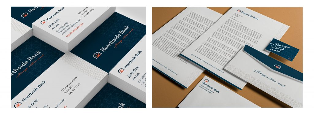
The new look takes the deep-rooted feeling of the fireside chat and modernizes the graphics. A bank can be cool and the Hearthside Brand proves it. A modern icon pairs with customized type and a bold color scheme to stand out in its footprint and among other banks.
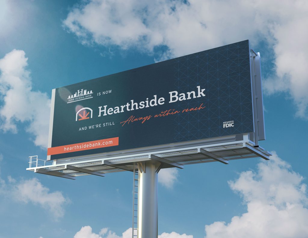
Any new brand must be introduced. First, you communicate with your existing clients. You must bridge the gaps with those who trusted you in your old brand. But a new brand is meant to attract new audiences, too. These are not mutually exclusive—they do not need to compete. Clearly communicating your new brand is the best step in bridging those gaps.
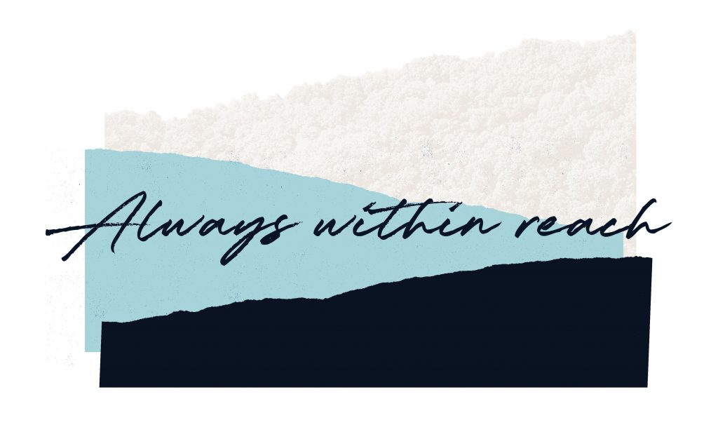
At its core, Hearthside Bank is a community bank. Connection and availability matter. Hearthside is the type of bank where, if you have a problem at 9:00 pm, you can get a banker on the phone. However, those bankers will work hard to make sure there are no problems. When a customer see an opportunity, they need a banker that is within reach.
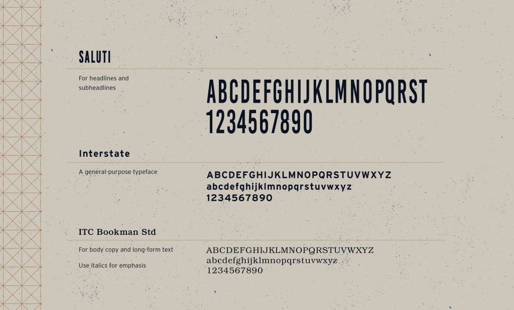
The written word is by far the largest volume of communication of any brand. The words matter most, but their look, weight, and relationship add meaning and clarity. Hearthside Bank’s type system balances old and new to provide excellent communication and beauty to each headline, sentence and paragraph.
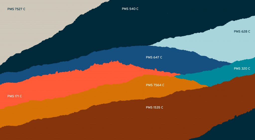
A robust color palette gives a brand vibrance and flexibility. Hearthside Bank’s palette is inspired by the lands where it was born. Mountains, trees, lakes, rivers, and open skies paint beautiful vistas. These hues are repurposed to give life to the Hearthside Bank brand.
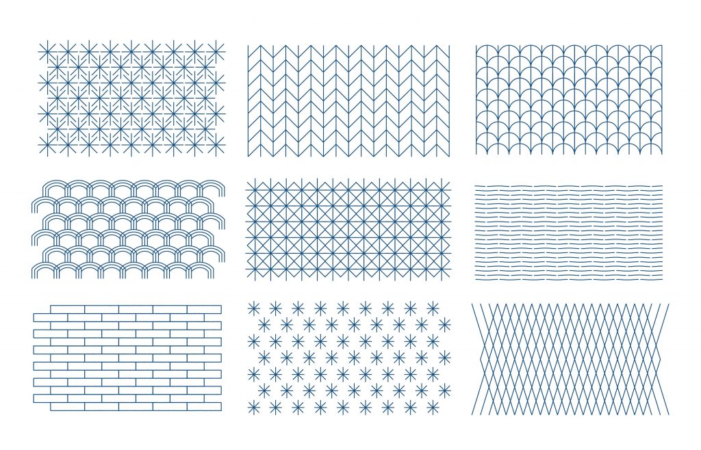
Mabus Agency believes that pattern is often the missing ingredient from bank brands. When we need depth and flexibilty, a brand-inspired pattern is a wonderful tool. The subconcious and unconcious ties of these patterns allows Mabus Agency to design more sophisticated materials than competing banks.

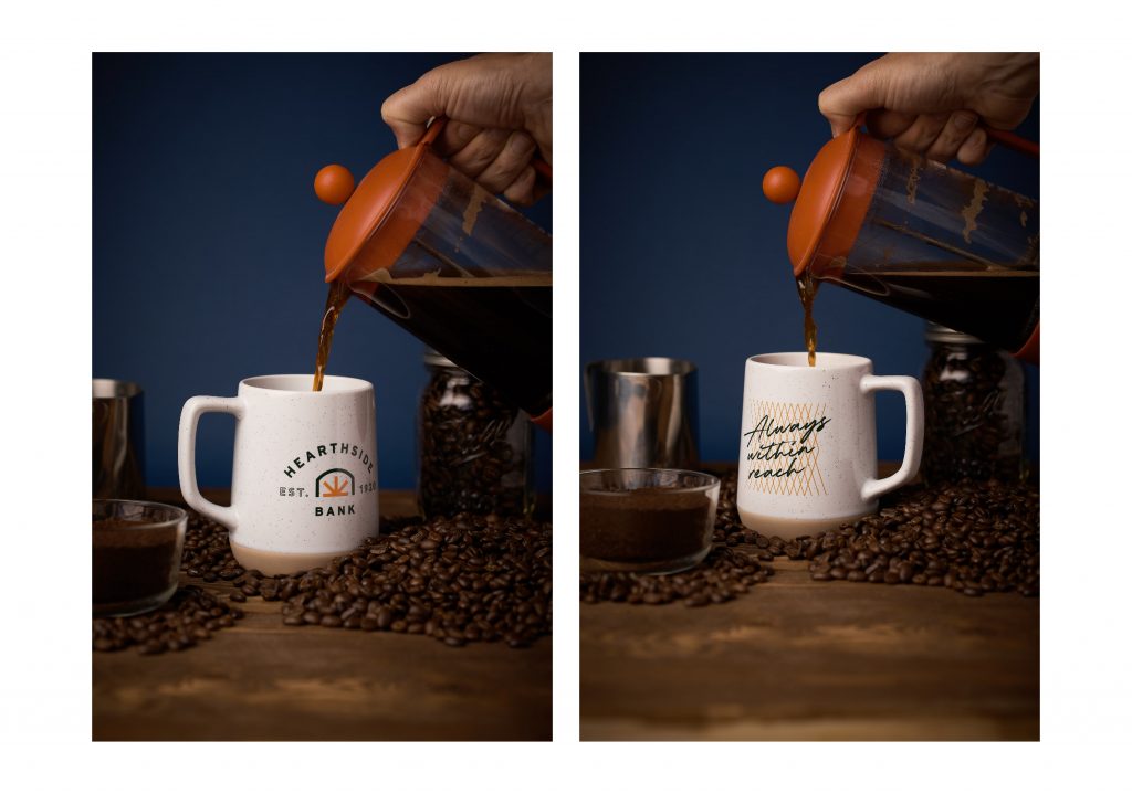
Every aspect of a brand is thought through. Creating photographs and styling them so they support the brand is no exception. From composition to layout to color, Mabus Agency creates an interlocking system of elements that build untouchable brands.
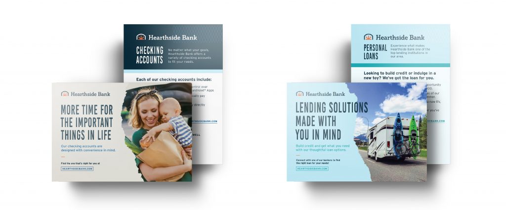
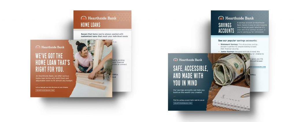
When brand elements combine in advertising, this is where we see magic. Every single component works in harmony to demonstrate beauty, strength, and care. The strongest brands are the brands who have the most flexibility—who can avoid homogeny while clearly communicating the brand itself.
