
Ready to talk?

Website

Digital
Ready to talk?
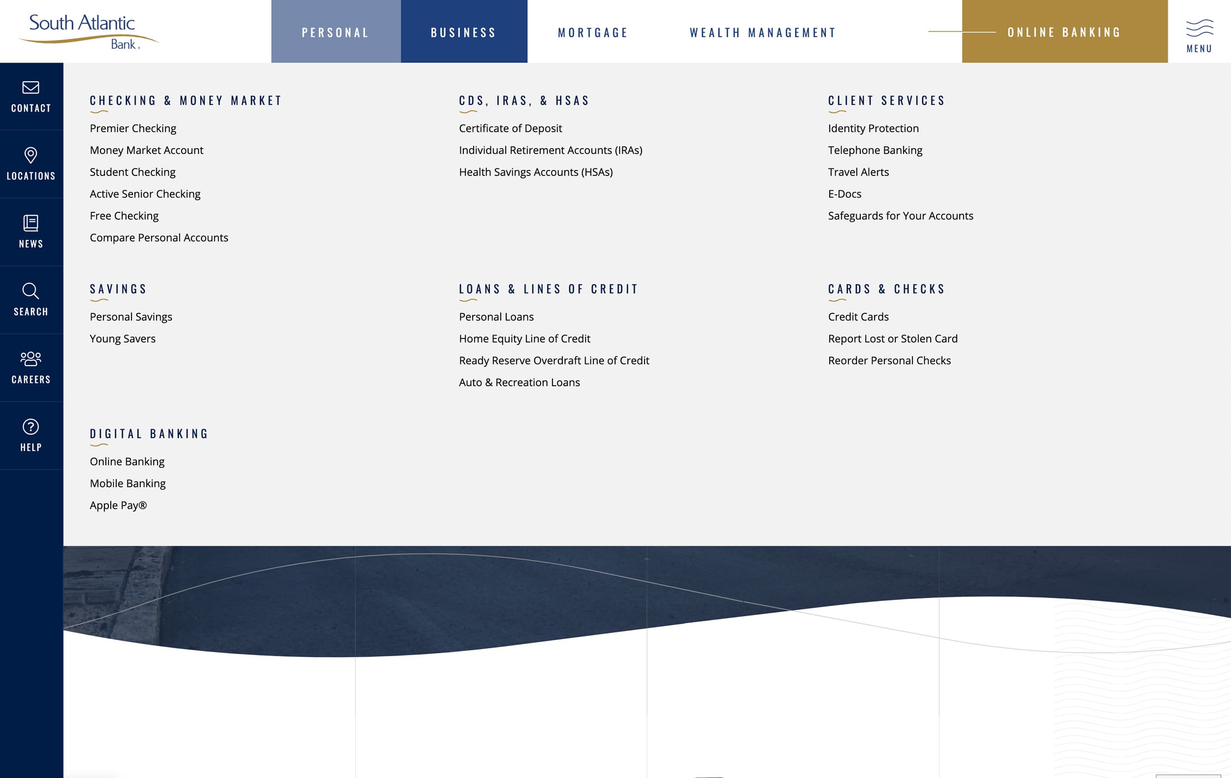
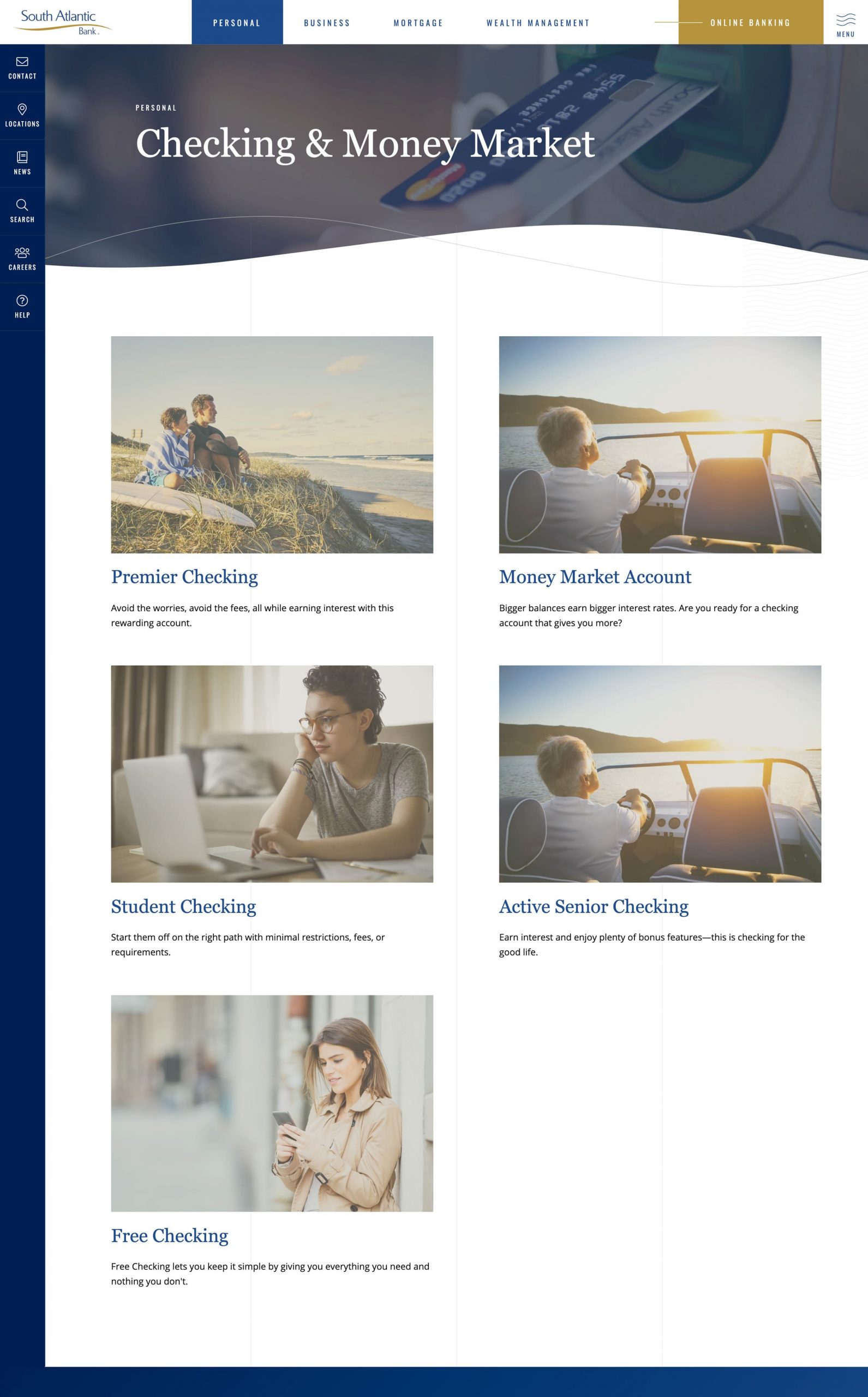
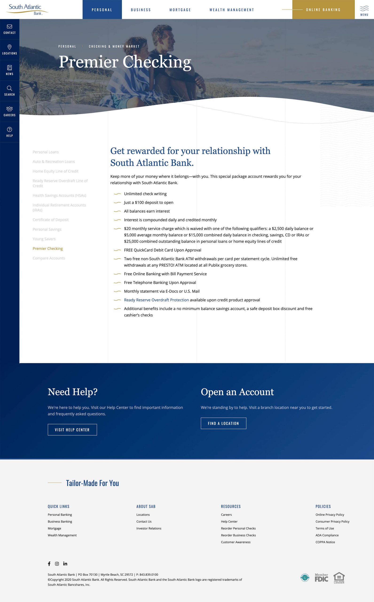
South Atlantic Bank, serving the Carolina coast, wanted a website that was visually appealing and communicated their message simply and succinctly. We organized their information into tiers and simplified their site map to improve navigation overall. We chose fonts and colors that speak well for their brand yet convey information in an easily-read way.
We constructed a site that is easily adaptable and upgradeable, creating a way for the client to easily refresh their overall look and feel in the future without having to build a brand new website from scratch.

South Atlantic Bank is a broad, complex business, so it’s important to have a website that allows users to easily find the information specific to their needs. We built menus that flow clearly and cleanly from point to point, and we present key functions with an eye on appealing simplicity.


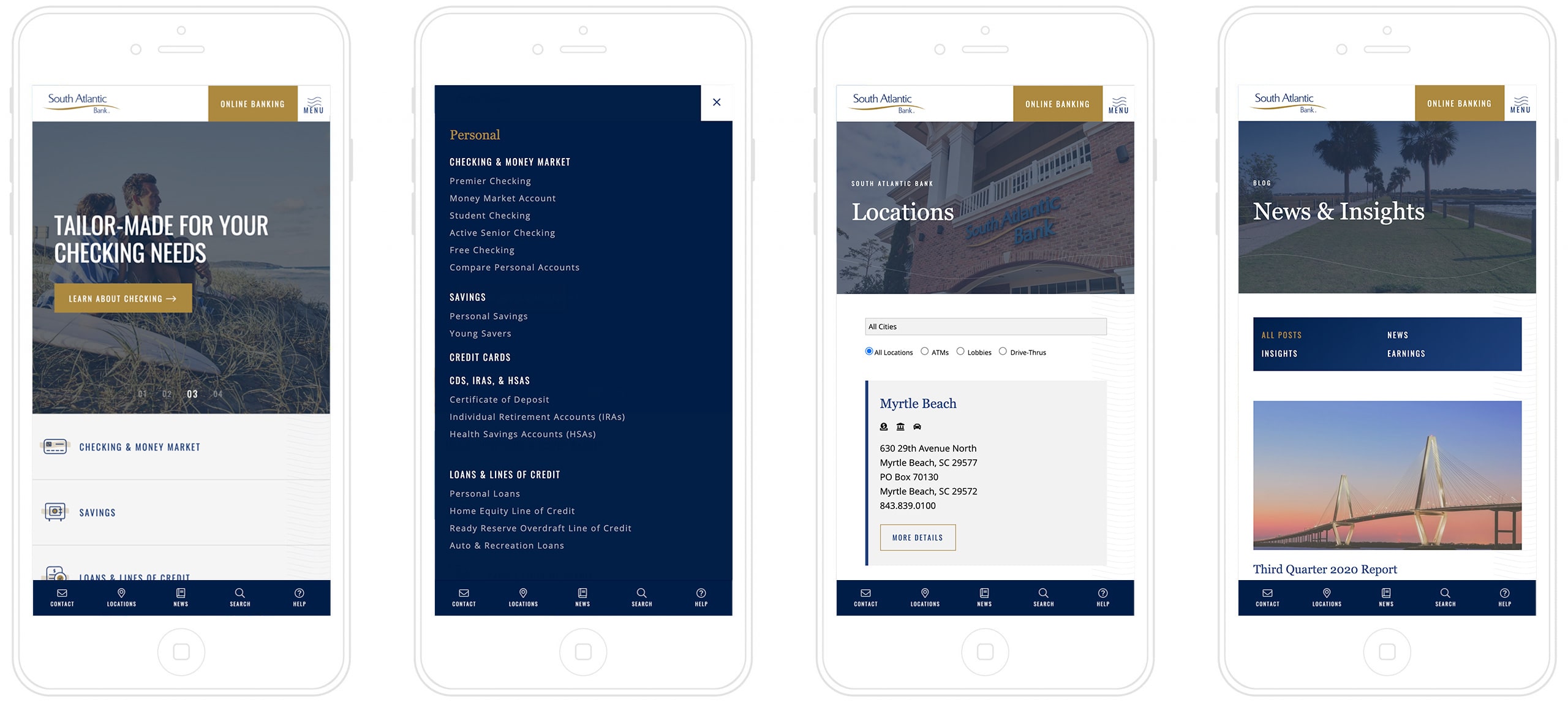
A growing majority of bank customers use their smartphone for many, if not all, their banking tasks, so crafting South Atlantic Bank’s site with mobile users in mind was critical. Customers accessing their account information on the go need a site that loads quickly and functions simply, but that doesn’t mean a site has to be unattractive. The elegant economy of the mobile-friendly site we built strikes a perfect balance of deliberate detail.
