

Ready to talk?

Brand

Website

Digital
Ready to talk?
MVB Bank came to Mabus Agency seeking a new website that would bridge the gaps between its traditional retail line of business and the bank’s burgeoning fintech division. Additionally, the site had to captivate a new, fast-paced client base in MVB’s progressive metro-D.C. market without leaving behind its legacy community banking clientele.
As with every website project, Mabus Agency’s content department completed an audit of MVB’s existing website and found several instances of incomplete or inaccurate product information, along with several missed SEO opportunities.
To create MVB’s new site map, we worked closely with MVB leadership in several divisions of the bank to shore up product information and prioritize bank services that had been misplaced on MVB’s original site.
Moving forward, the new site map served as a blueprint on which to build MVB’s new website.
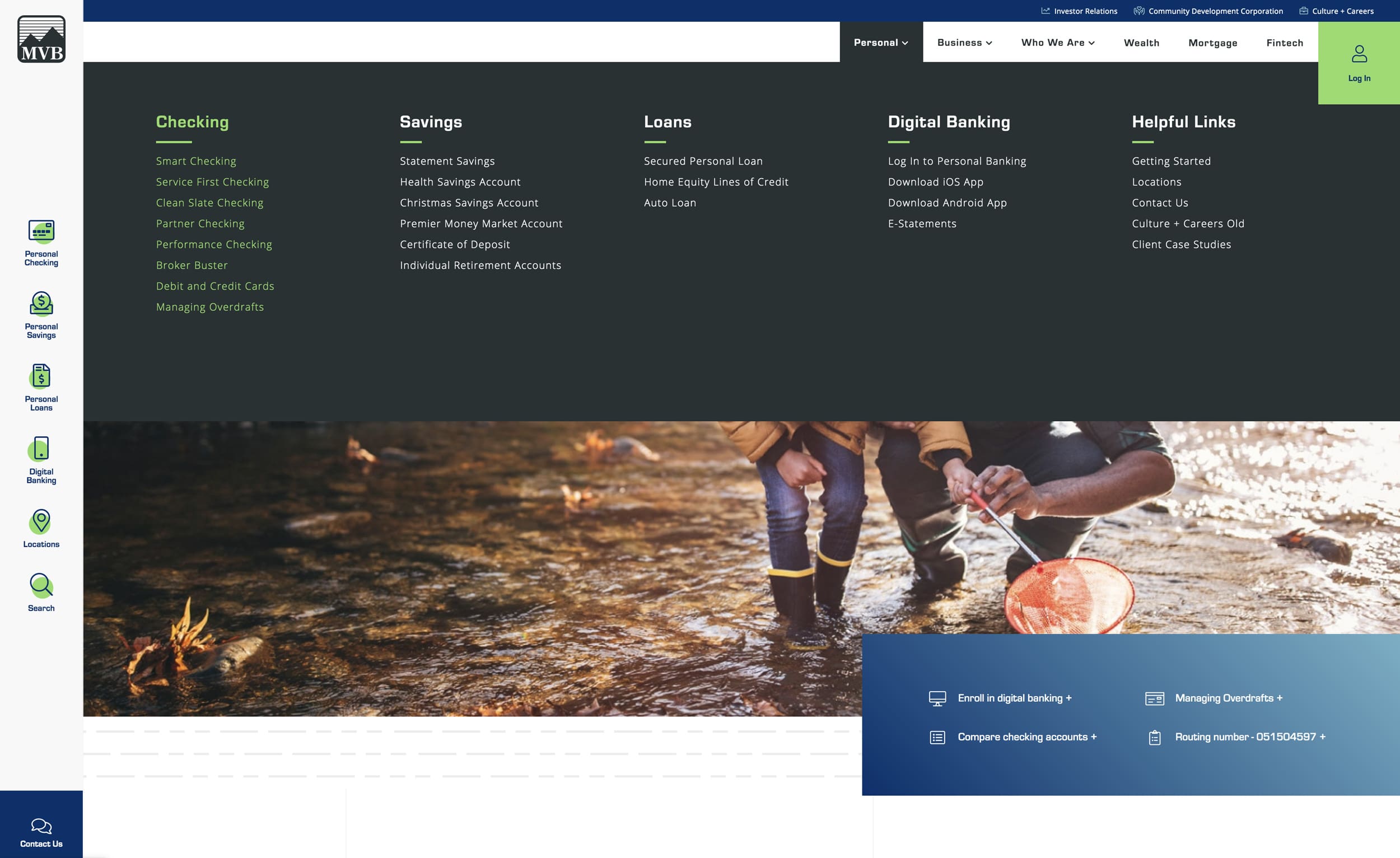
Most bank websites lack an intentional hierarchy of products and services. We created the new site with structure in mind, giving deep thought to the end users of each and every product.
By establishing hierarchy and presenting the user with numerous navigational starting points, MVB’s new site feels intuitive and familiar, even for first-time visitors.
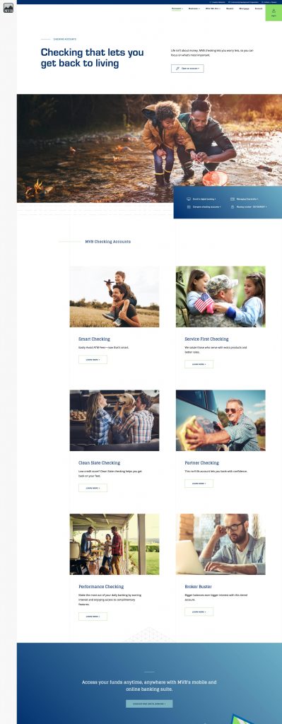
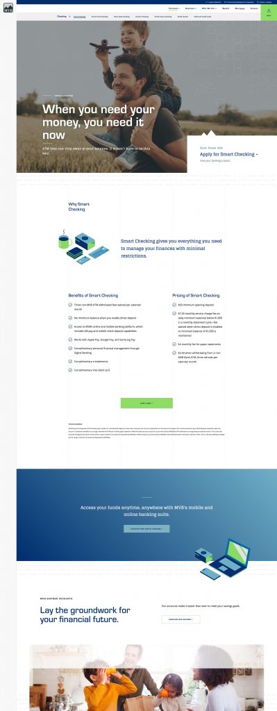
Our graphic designers created a custom set of isometric illustrations to provide another dimension of individuality to MVB’s new site. With a technological feel and a unique personal touch, these illustrations achieve a forward-facing aesthetic without feeling cold or robotic.
But Mabus Agency creates brand assets to enhance usability, not just to look good.
Each illustration denotes a category of banking like checking, savings, and lending. They serve as another navigational element to orient a user on the page. MVB’s isometric illustrations can easily be applied to other assets and campaigns.

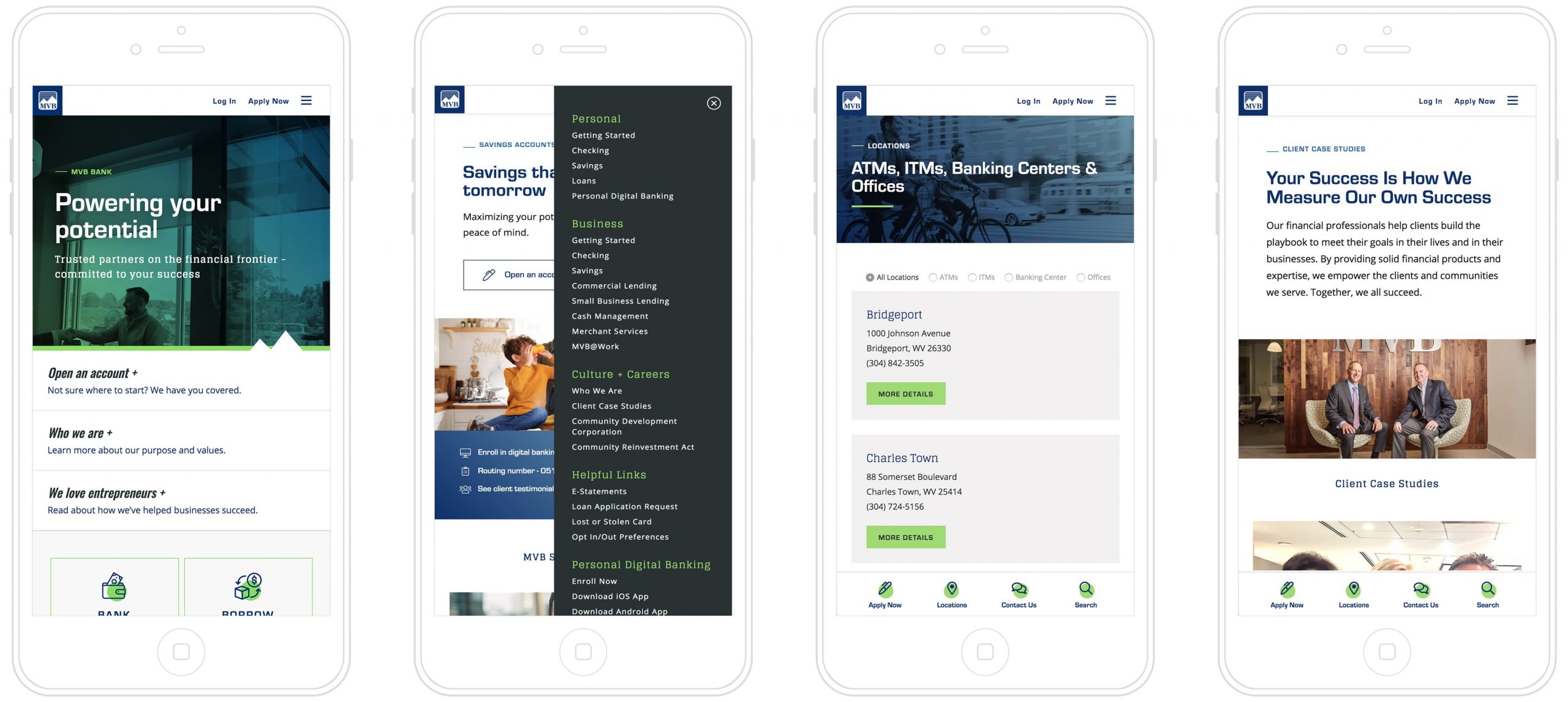
Mabus Agency’s web team pulled out all the stops to ensure MVB’s new site excelled on mobile devices. By following the site map’s hierarchy and keeping in mind a user’s most immediate banking needs, they created an outstanding banking experience that is unique to mobile devices.
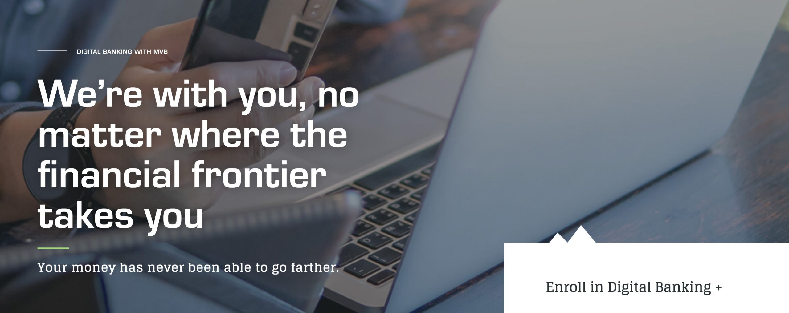
MVB’s mission is to empower customers to break out of their financial boxes. The bank’s tagline, “Your trusted partner on the financial frontier,” implies an assertive, adventurous personality.
Throughout the site, from headlines to product descriptions, our content team implements this can-do voice to further establish MVB’s progressive brand.
Working with MVB was a truly collaborative effort. From the start, it was clear that they cared about the project and would do anything they could to assist in the site’s creation. The result is a website the bank can continue to build out and stock with helpful financial resources, products, and testimonials.